Geeta’s
Branding, Packaging
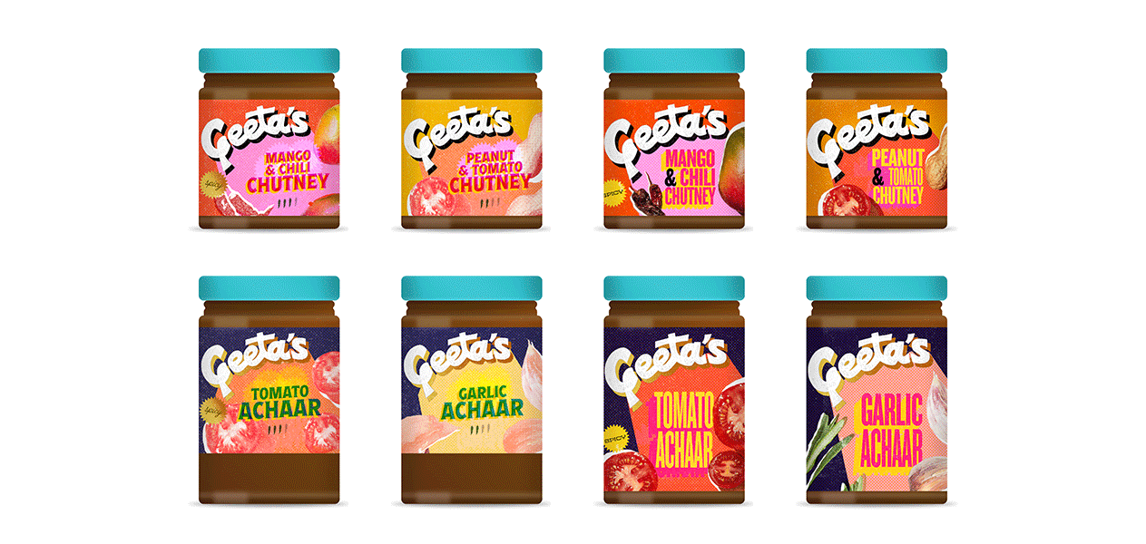
Commercial Indian cuisine is spoiled by stereotypes, struggling to feel both modern and authentic. This rebranded package design of a family-owned company is all about celebrating the festivity of India through food. With Geeta’s, traditional Indian condiments become American kitchen must-haves, from the bazaar to the bowl.

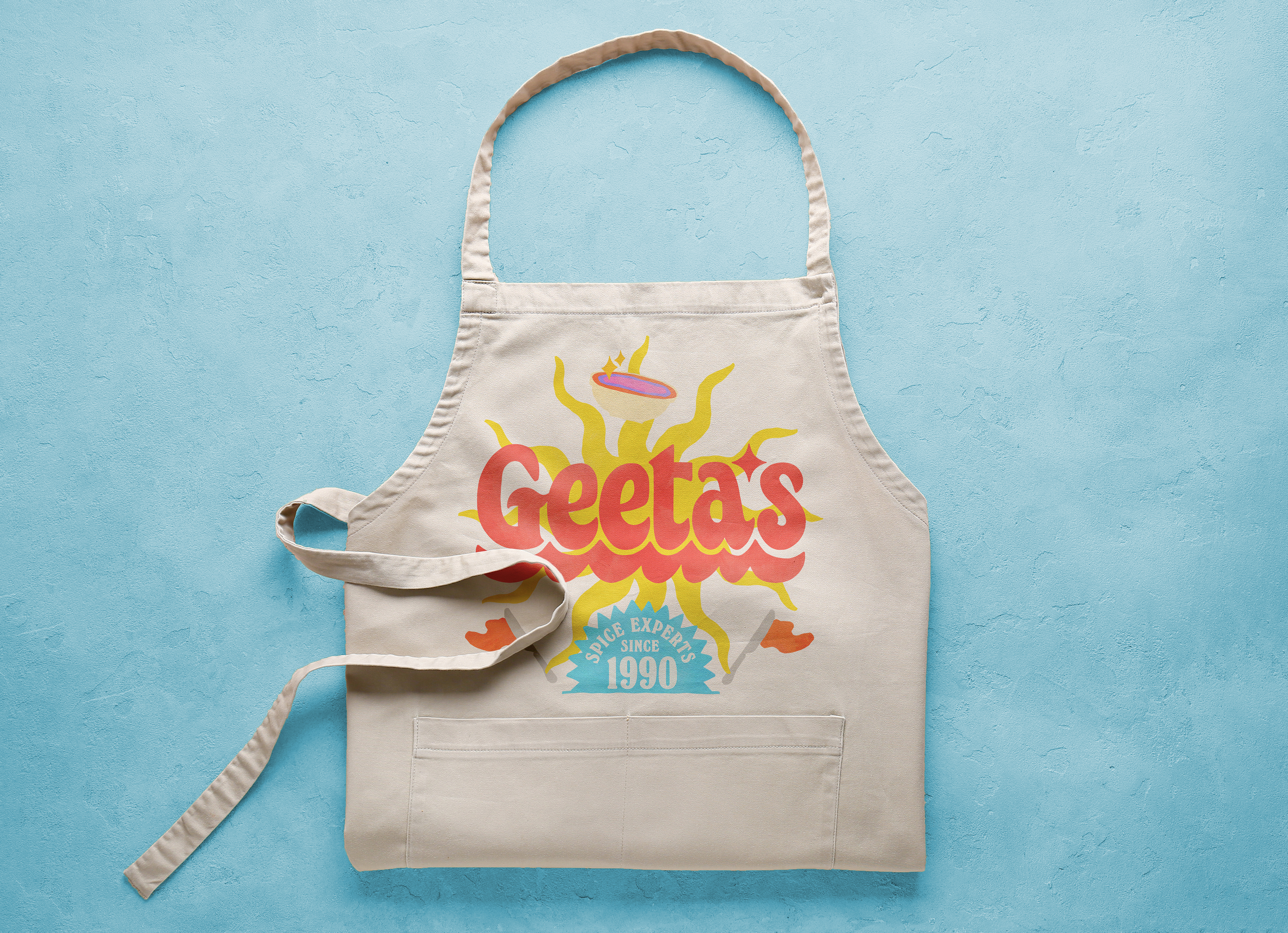
︎︎︎ The Geeta’s wordmark takes cues from swashes in Hindi calligraphy and embellishments in Indian street art.
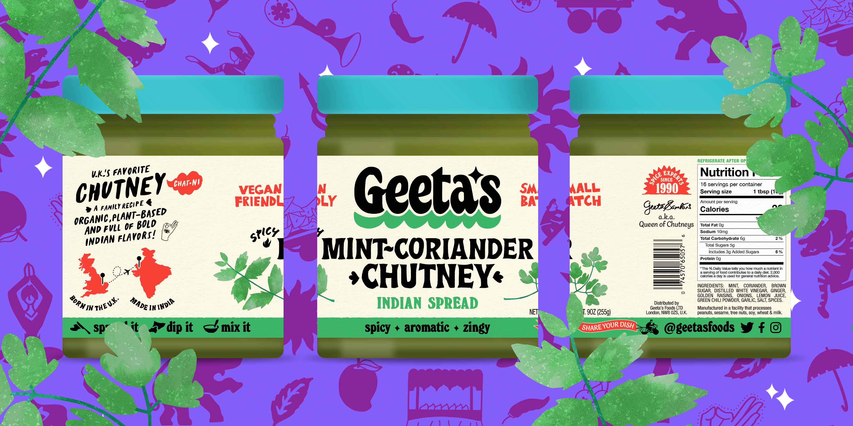
︎︎︎ Geeta’s revamped packaging pays homage to its homemade origins, featuring hand-drawn imagery and typography in an eclectic tone (with a twist of imperfection). Tidbits of information decorate the jar while framing the label and guiding the eye.
︎︎︎ Geeta’s revamped packaging pays homage to its homemade origins, featuring hand-drawn imagery and typography in an eclectic tone (with a twist of imperfection). Tidbits of information decorate the jar while framing the label and guiding the eye.

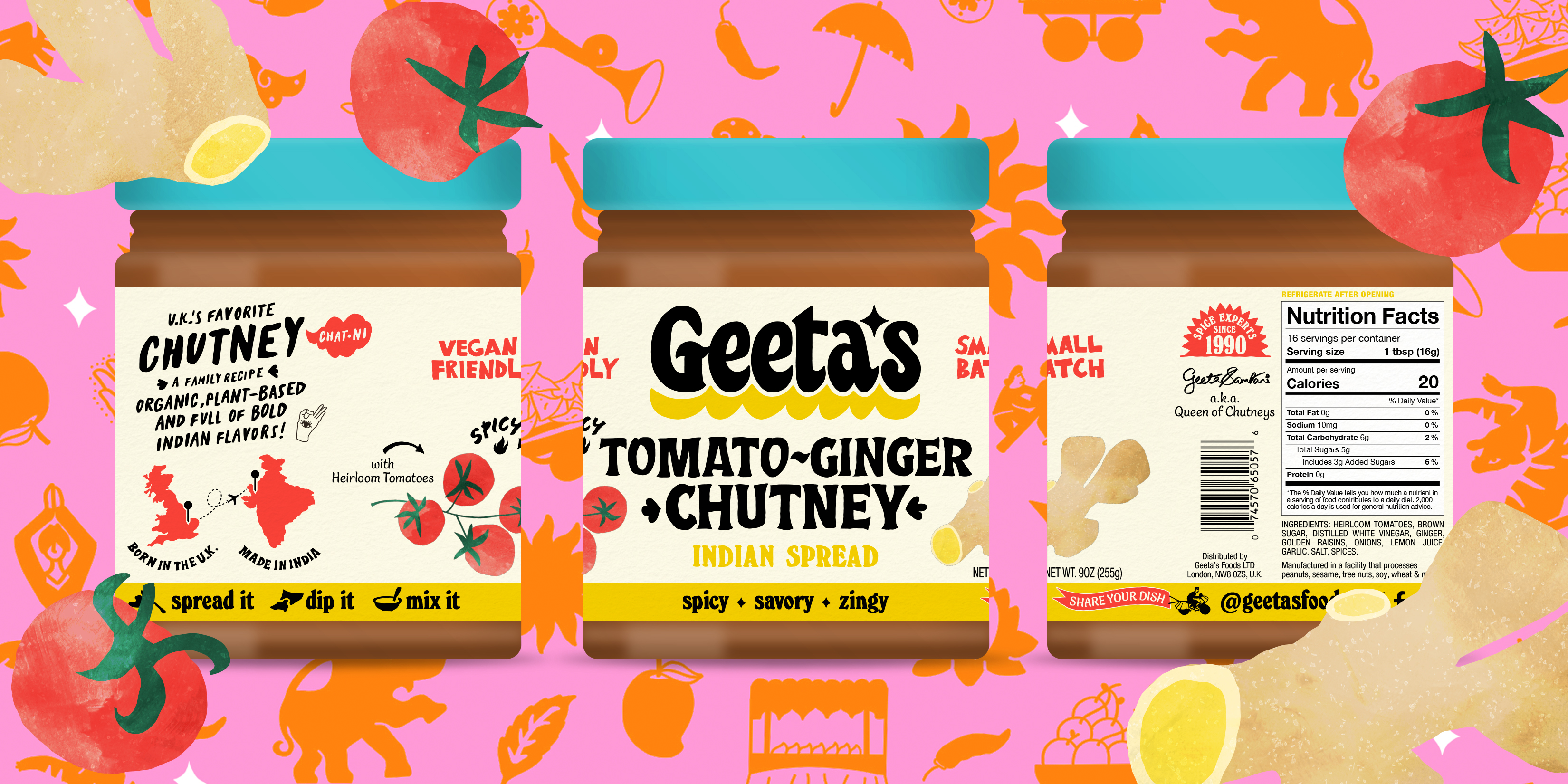


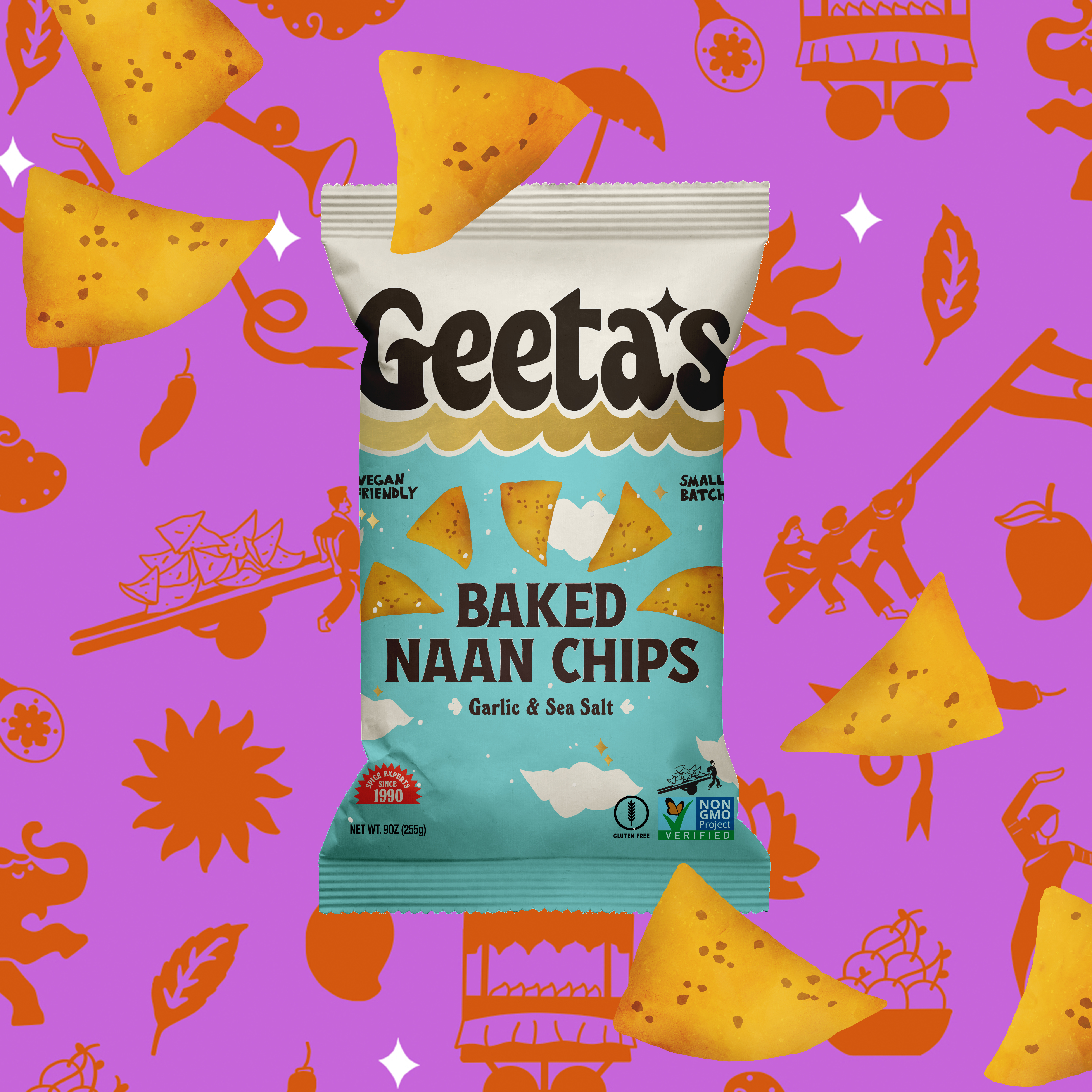
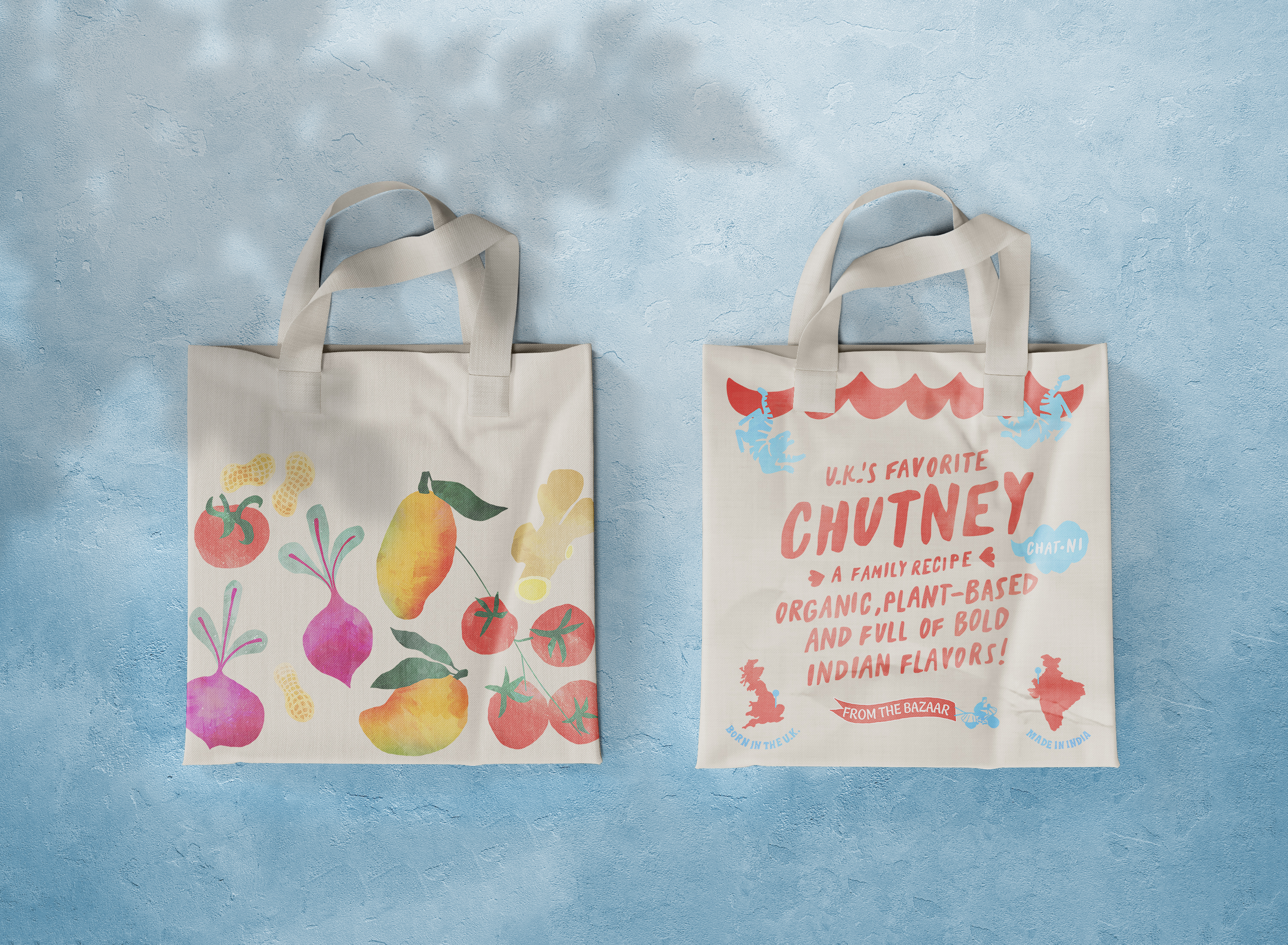


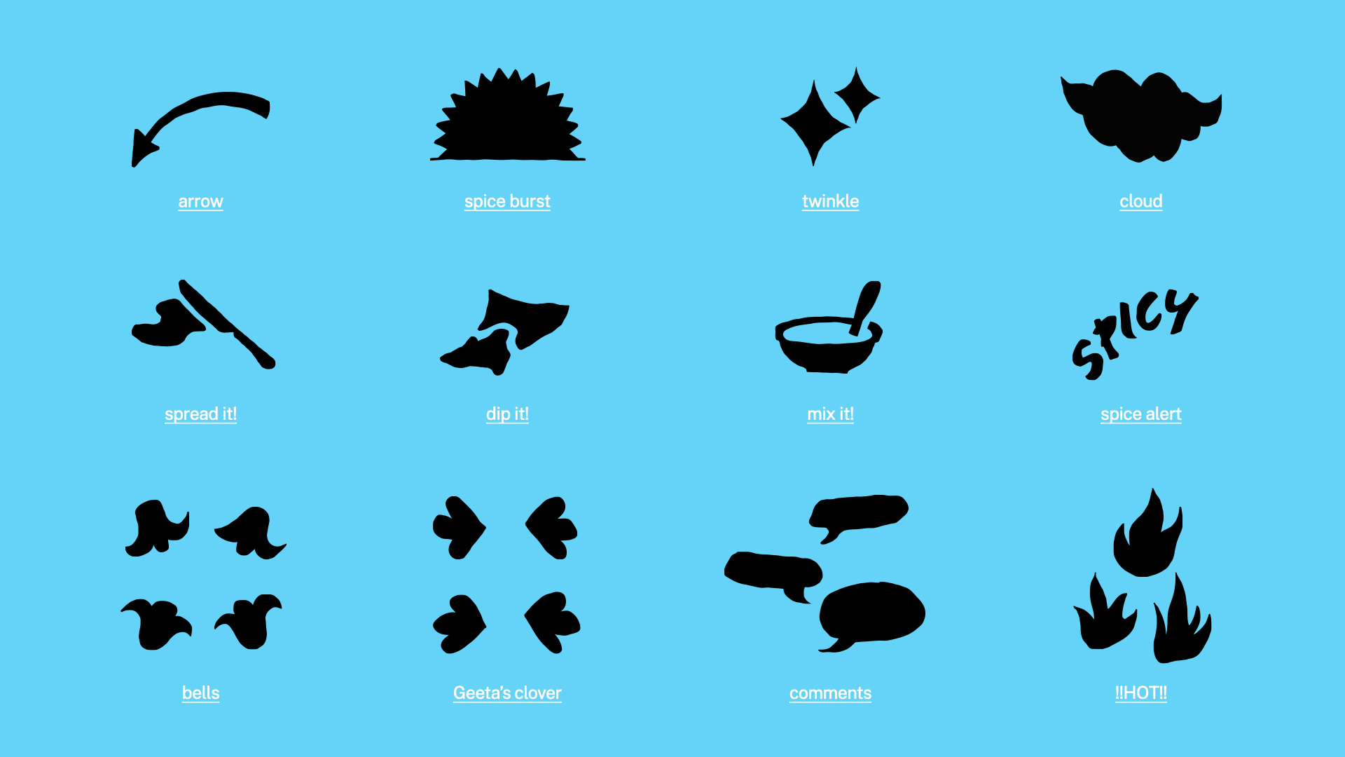
︎︎︎ The Geeta’s identity includes a range of playful illustrations which introduce a whimsical attitude while alluding to Indian festivities and traditions.
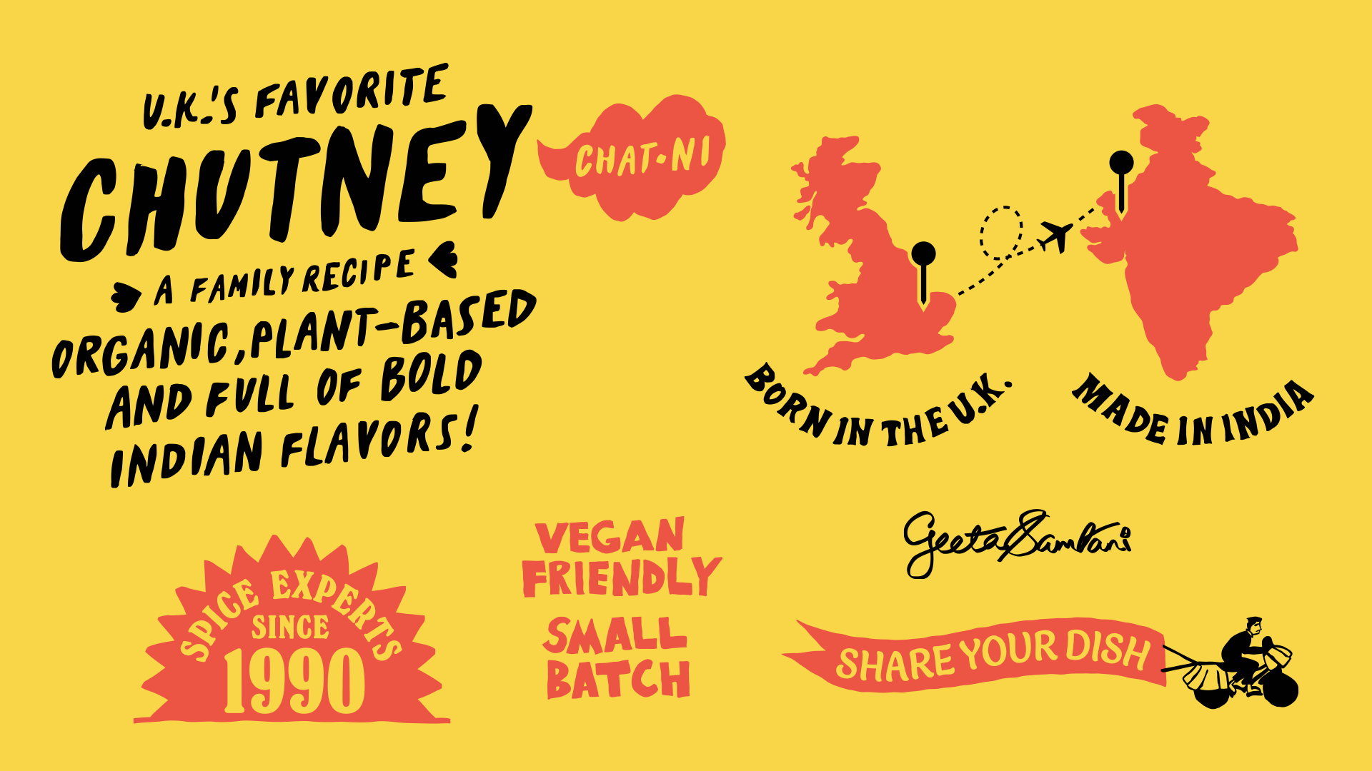
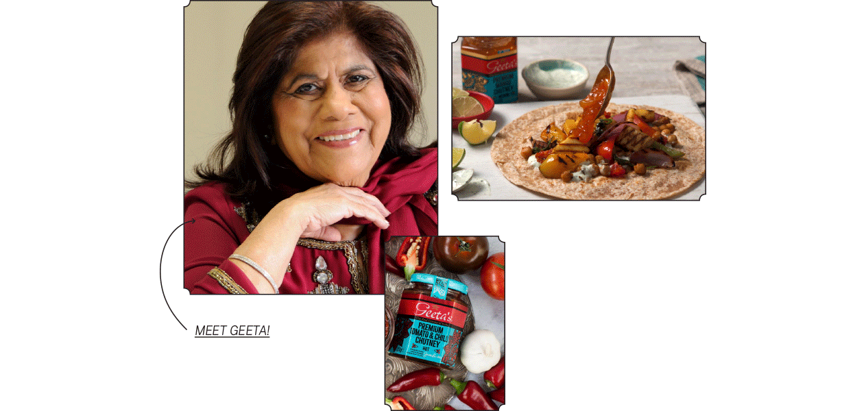
︎︎︎ The founder’s vision of authenticity is carried through hand-drawn elements that communicate heritage and tell the brand story in a familiar tone of voice.

︎︎︎ Street art brings a signature tone to Indian cities that I wanted buyers to experience with Geeta’s products. Inspired by the country’s decorated streets, ingredients are painted with rough lines, bold textures, and vivid colors.
︎ BACKGROUND ︎
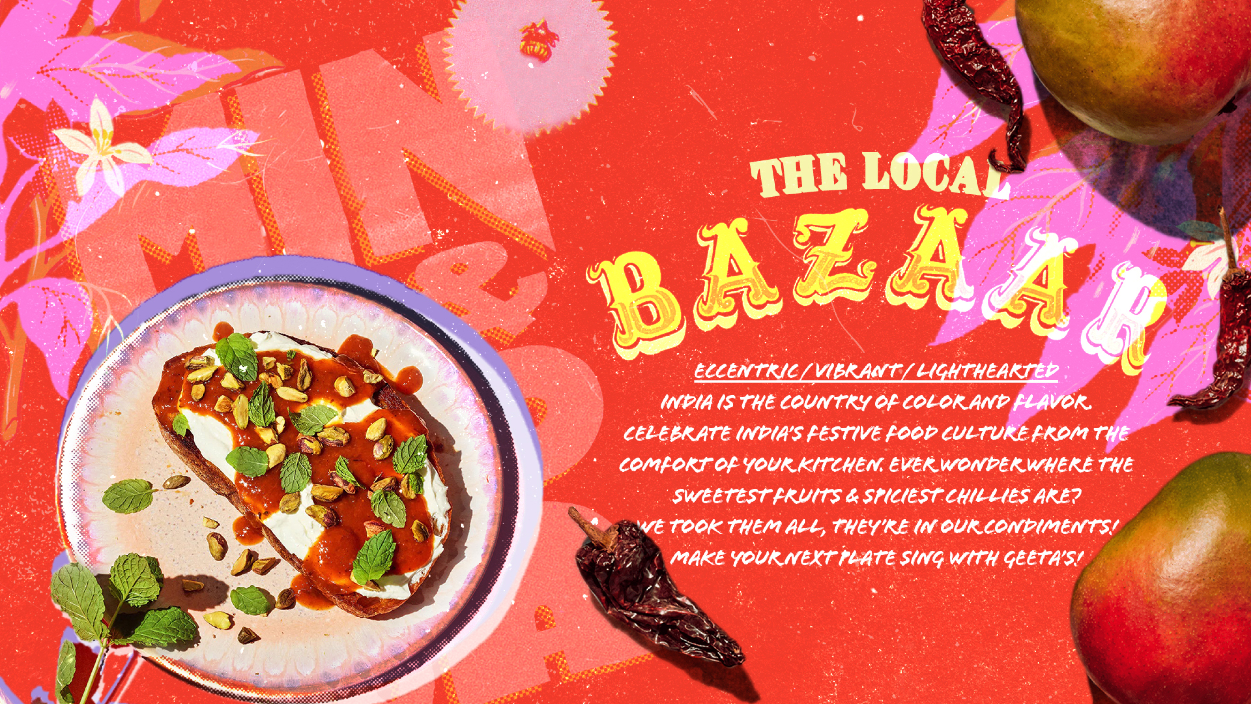
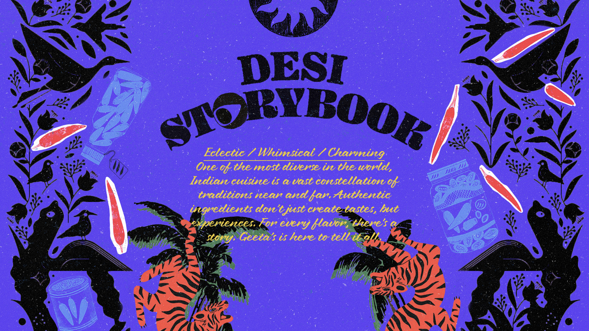

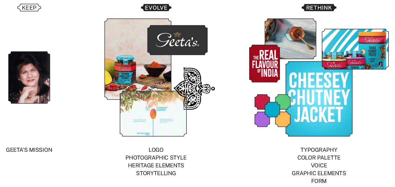
︎︎︎ A series of visual tone boards were created to capture distinct aesthetics for the rebrand. These compositions served as previews of different themes to help curate the appropriate visual language for the Geeta’s identity.

︎︎︎ A hand lettered approach offered the ultimate flexibility and a “homemade” tone. I explored ways of incorporating gestures from Hindi calligraphy into the English alphabet.
