Petra
Branding, Products
This brand identity challenges the beauty industry, which is often highly genderized and overcomplicated. Petra is a hypothetical sub brand of Pixi Beauty that democratizes cosmetics by bridging gaps within products and users. Its fluid brand identity embraces individuality through color and modernizes the beauty process. The goal is a space where anyone can practice both simplicity and expression through cosmetics.
︎︎︎ The Petra wordmark is a modern interpretation of universal symbols. In motion, it emphasizes the distinct pieces that form a unified whole, referring to the diverse needs that make up a “beauty for all” approach.


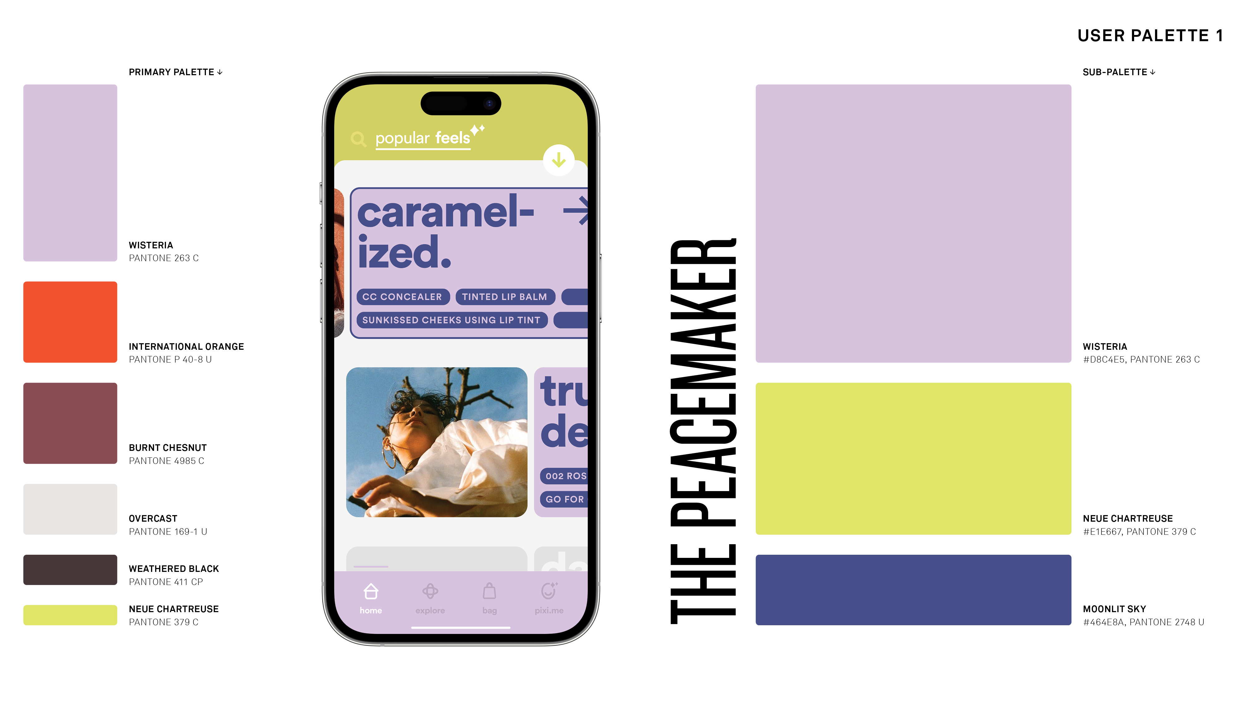
︎︎︎ A crucial step in forming the identity was curating colors that are both vividly expressive and gender-neutral.
︎︎︎ The palette plays a special role, appearing even in subtle moments to infuse energy and character.
︎︎︎ The palette plays a special role, appearing even in subtle moments to infuse energy and character.

︎︎︎ Petra’s typographic style is sharp, approachable, and prioritizes legibility.

︎︎︎ The product line fuses skincare and makeup to address a wider range of needs in fewer SKUs.


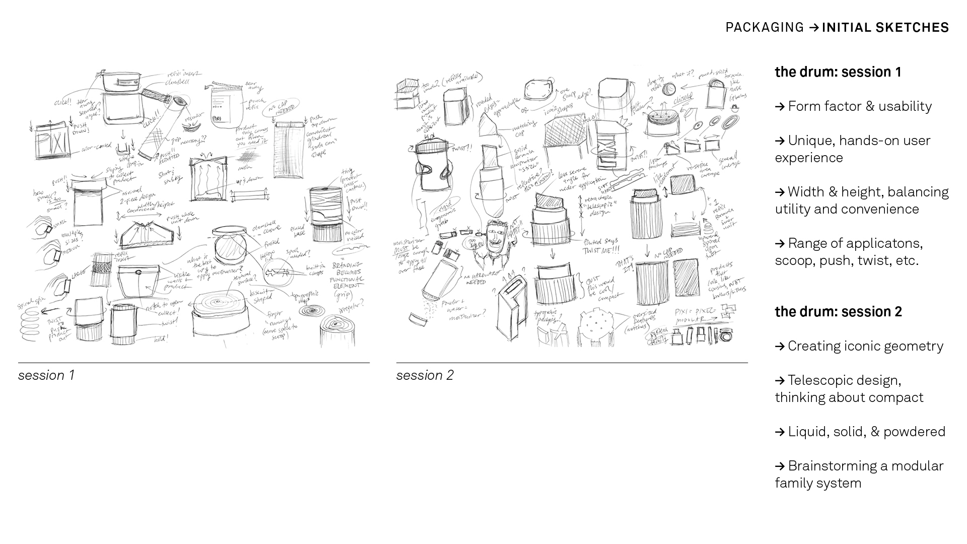
︎︎︎ The proprietary, utensil-inspired forms are designed to accompany a diversity of lifestyles. The application and refill processes are simplified through rudimentary movements and color-coded segments.


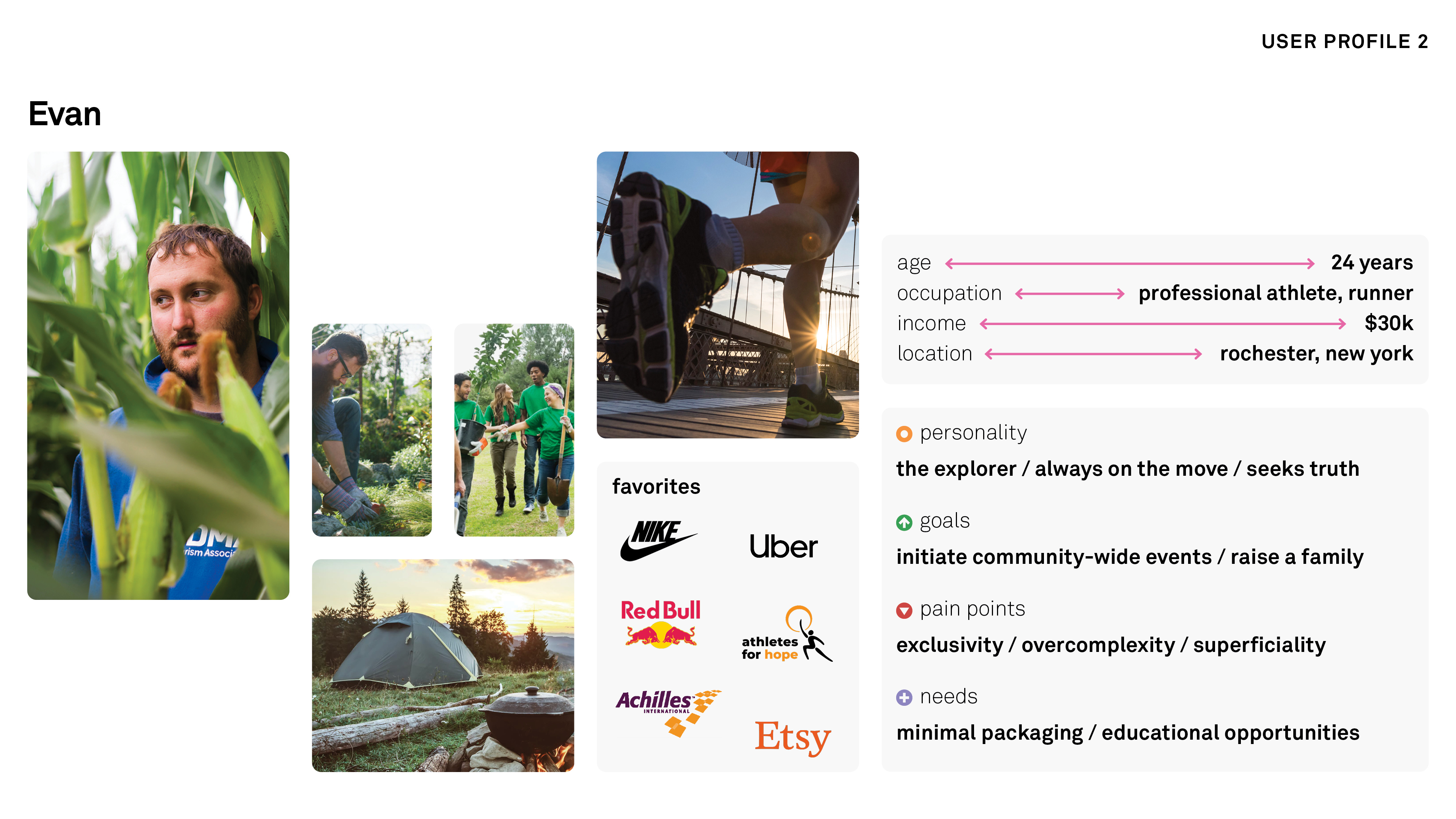
︎︎︎ Petra embraces individuality through technologies like virtual reality and environment-based data, allowing users to experiment with products on their digital avatars and receive timely tips about items they’ve purchased.
︎︎︎ The following are examples of sub-palettes (extensions of the primary palette) assigned by personality and applied throughout the interface with Google U.
︎︎︎ The following are examples of sub-palettes (extensions of the primary palette) assigned by personality and applied throughout the interface with Google U.


︎ BACKGROUND ︎
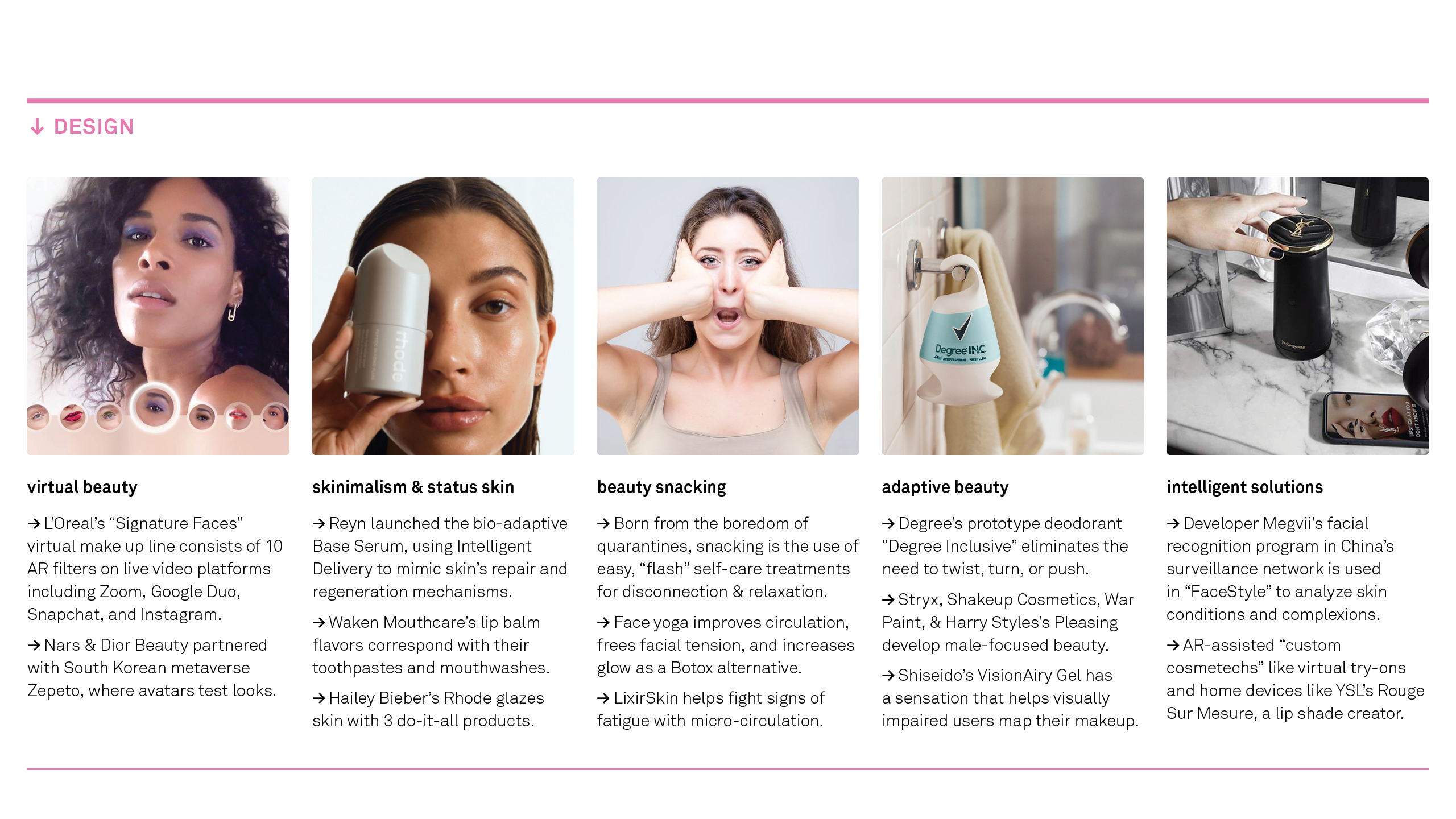
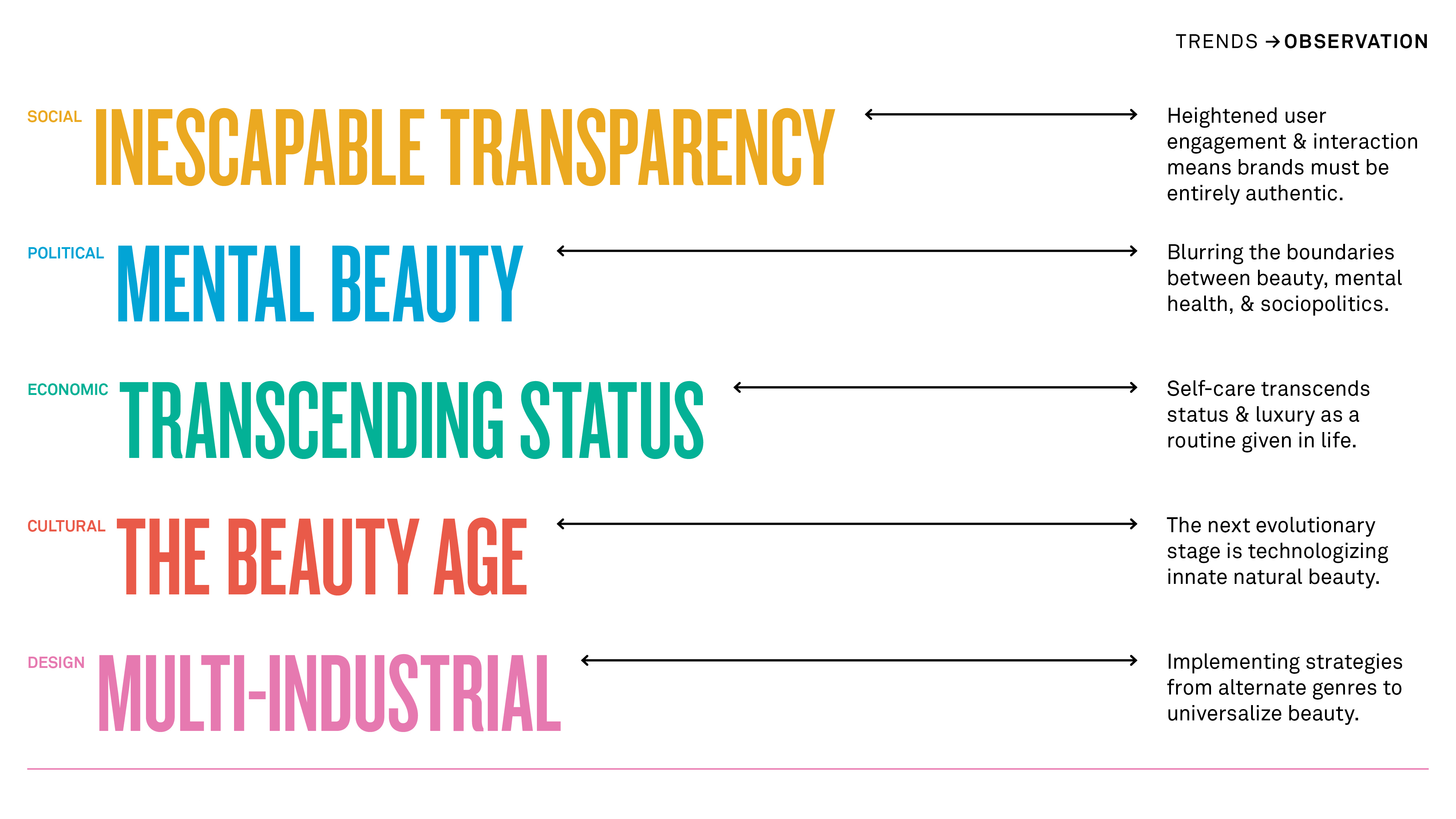
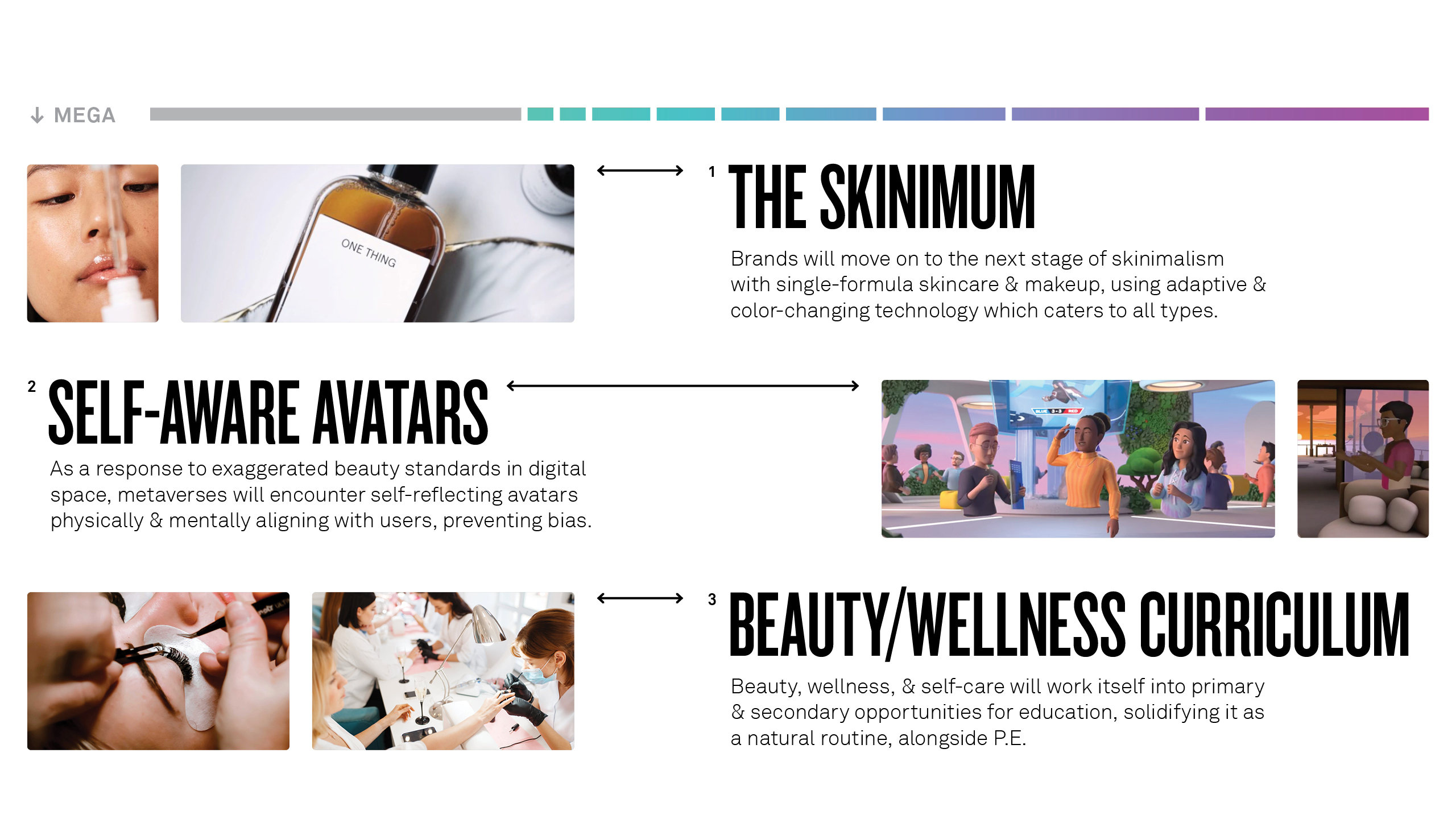
︎︎︎ This project involved a thorough process of trend observation and projection to inspire future-proof creative work. Utilizing WGSN, publications, and trusty TikTok, I completely immersed myself in the world of beauty.