Thrasher Magazine
Editorial Design
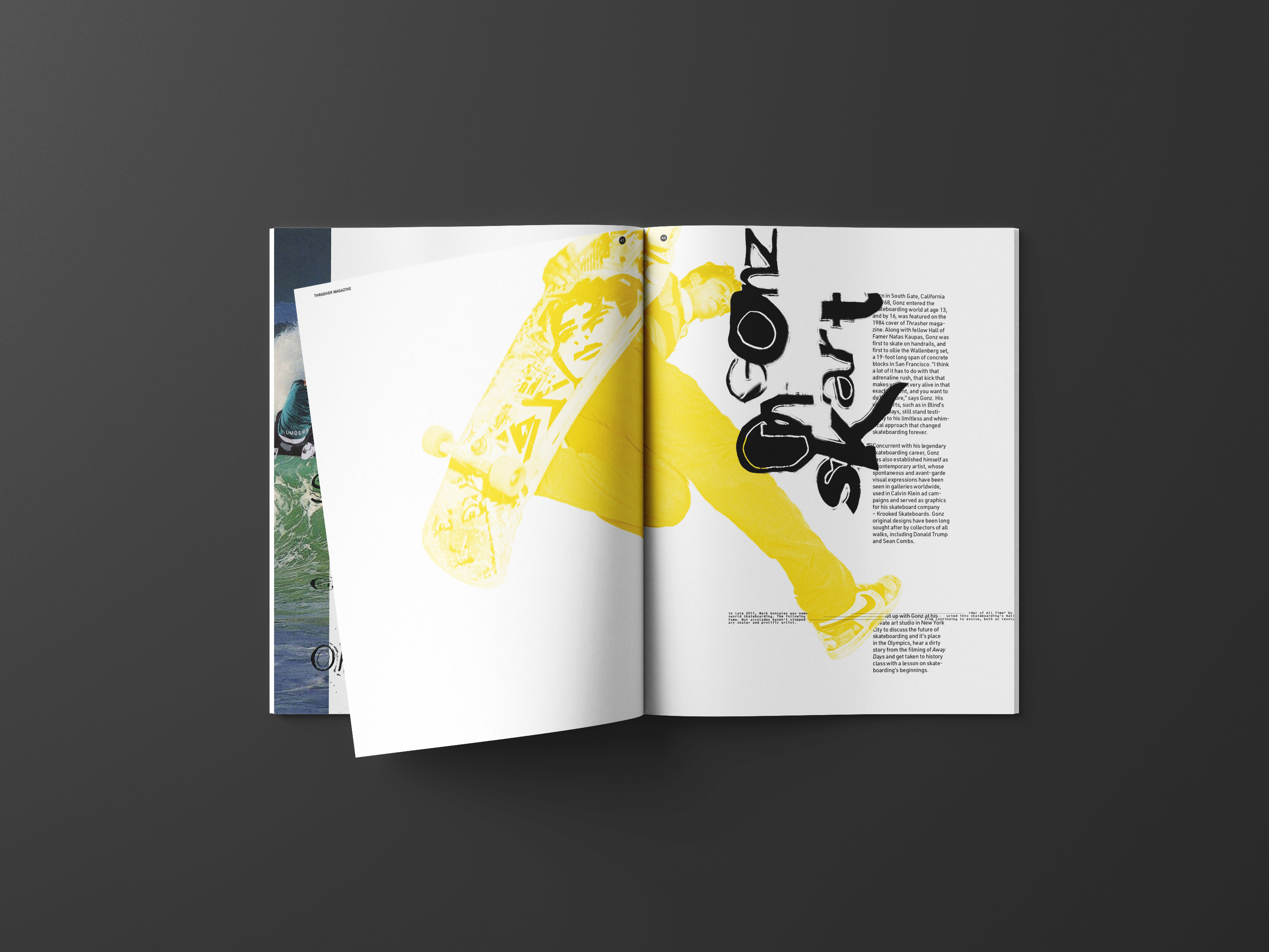
This editorial project contains two reenvisioned issues of Thrasher Magazine, a publication catered to the fashion, music, and culture of skateboarding. Through a deconstructive, analog design language that reflects the culture’s disruptive attitude, the redesigned Thrasher Magazine presents skateboarding as a distinguished sport and modern art form.
︎ ISSUE 1 & 2 ︎


︎ ISSUE 1 — FULL FEATURE ︎
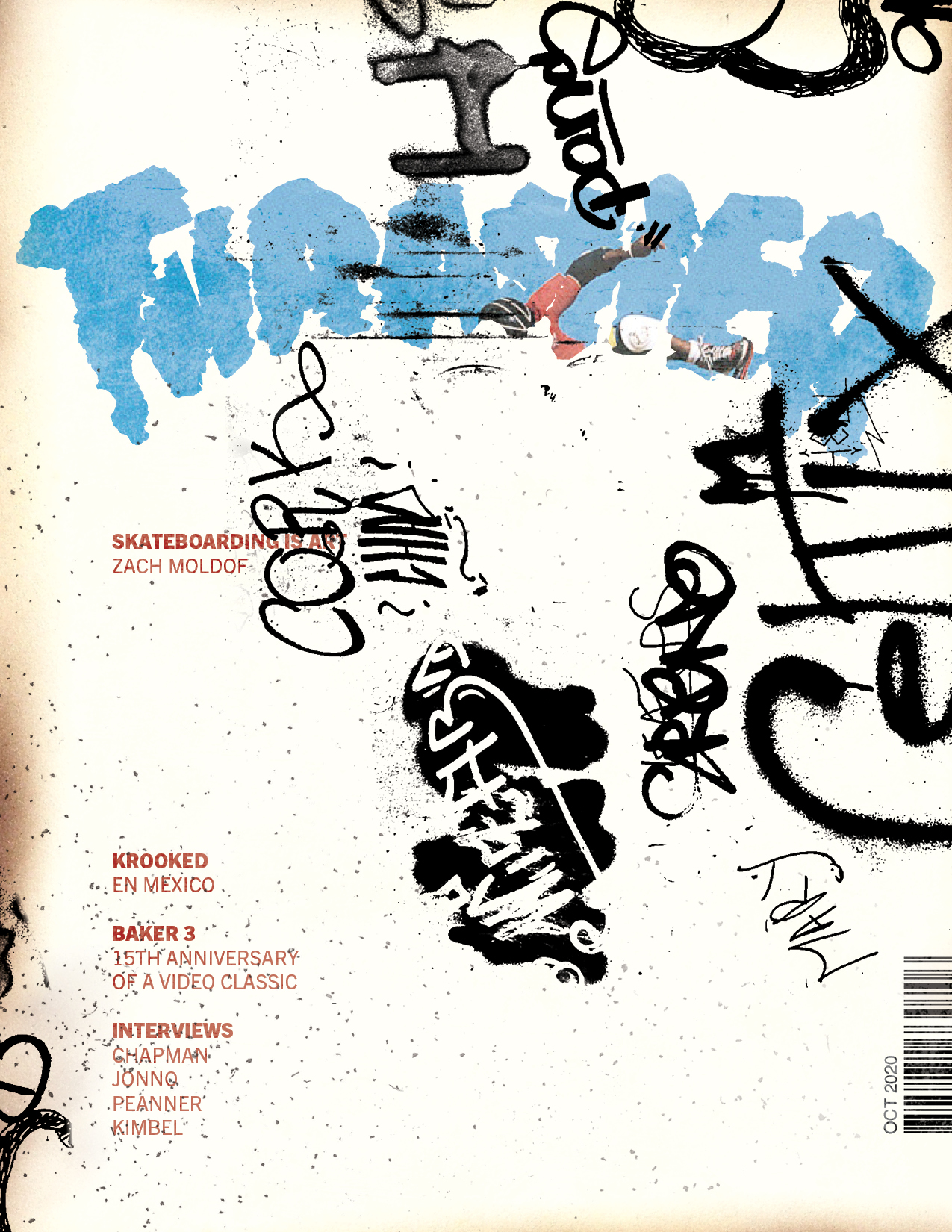
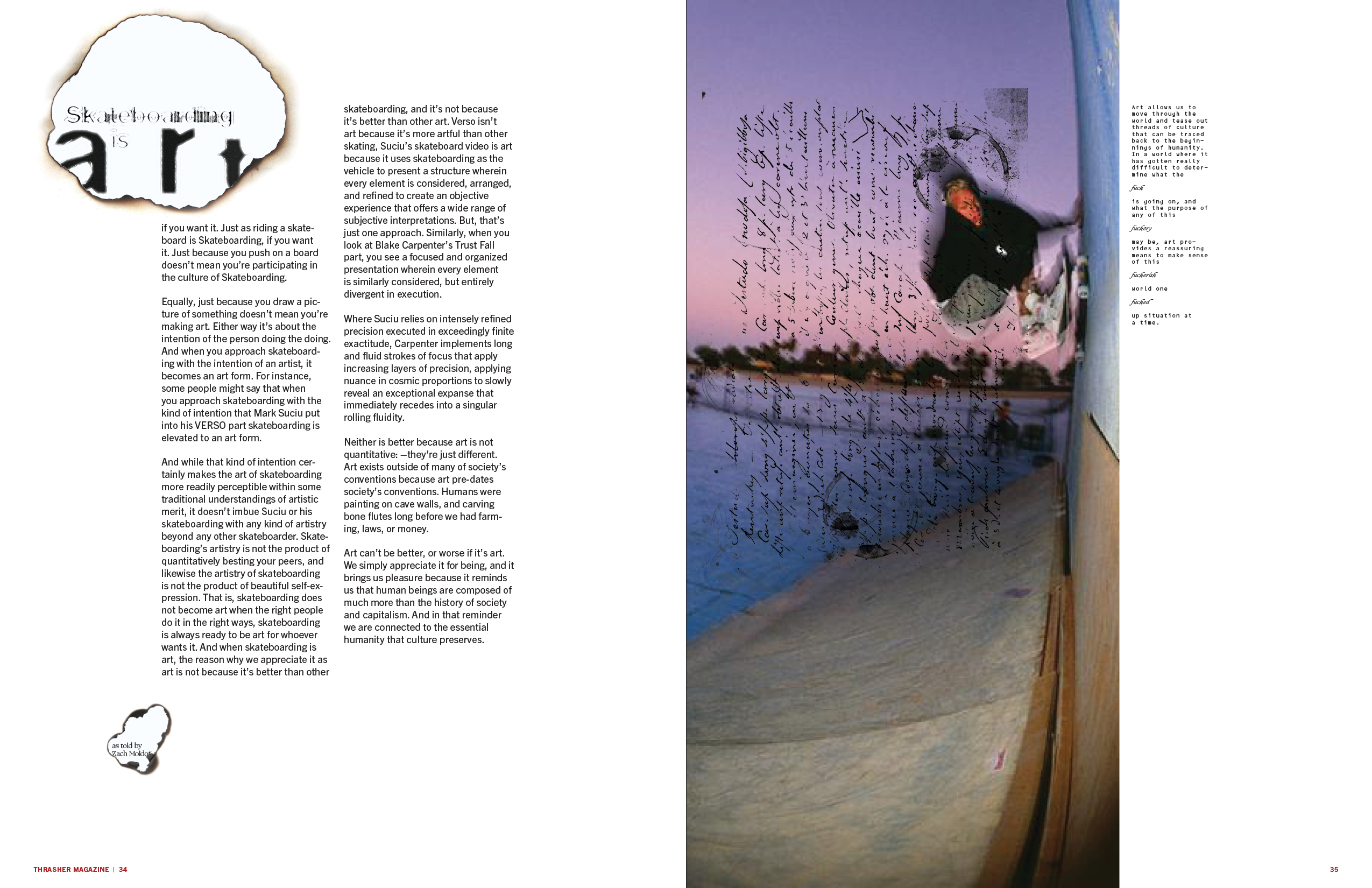
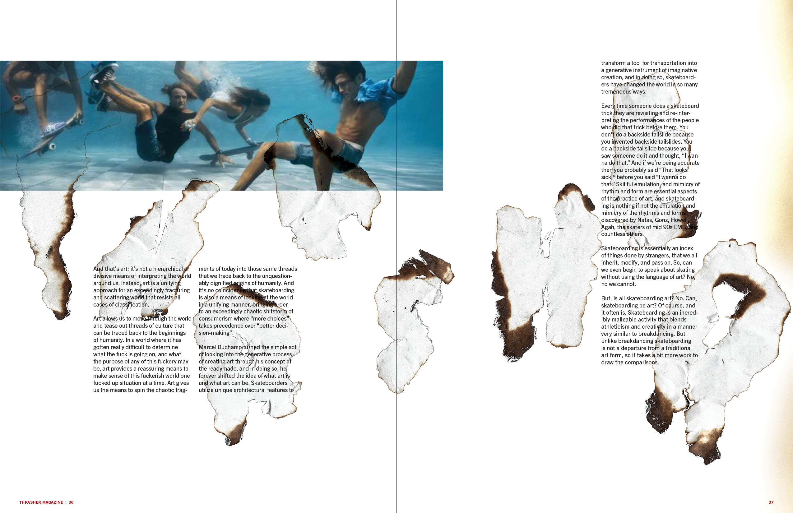
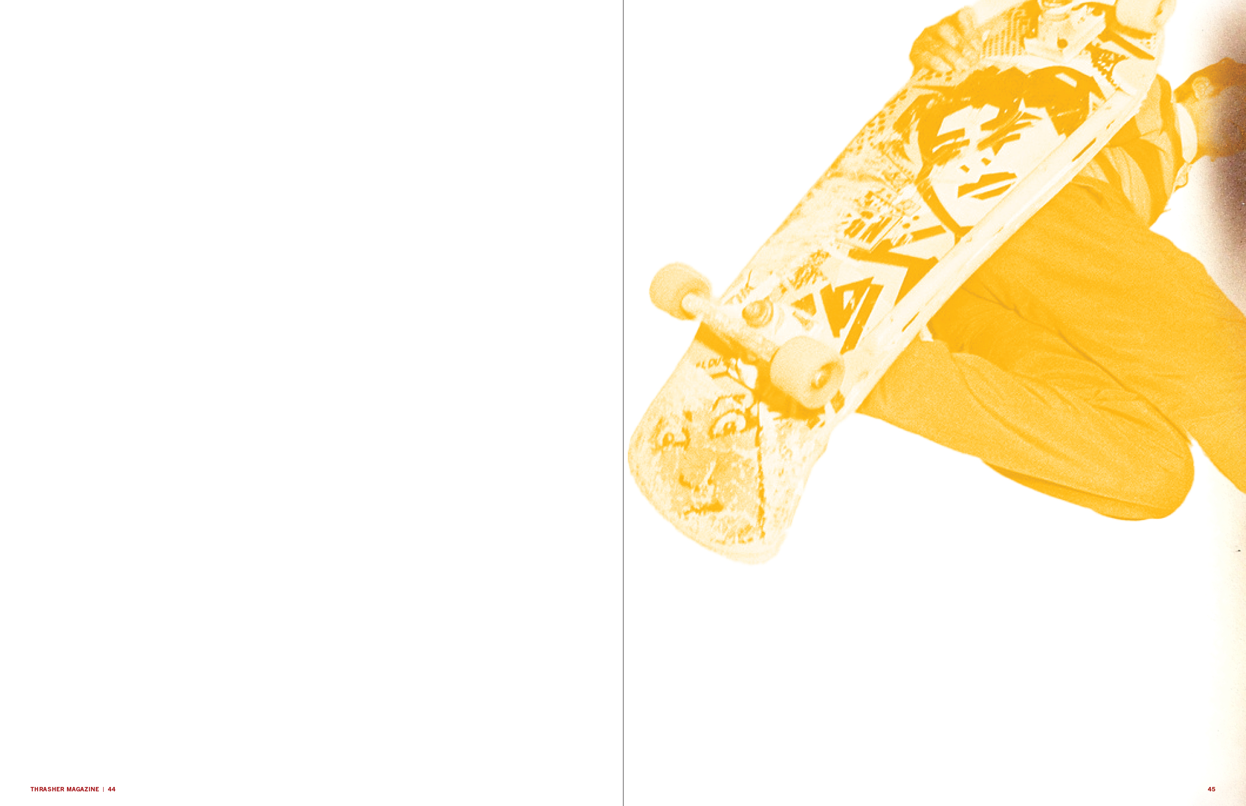
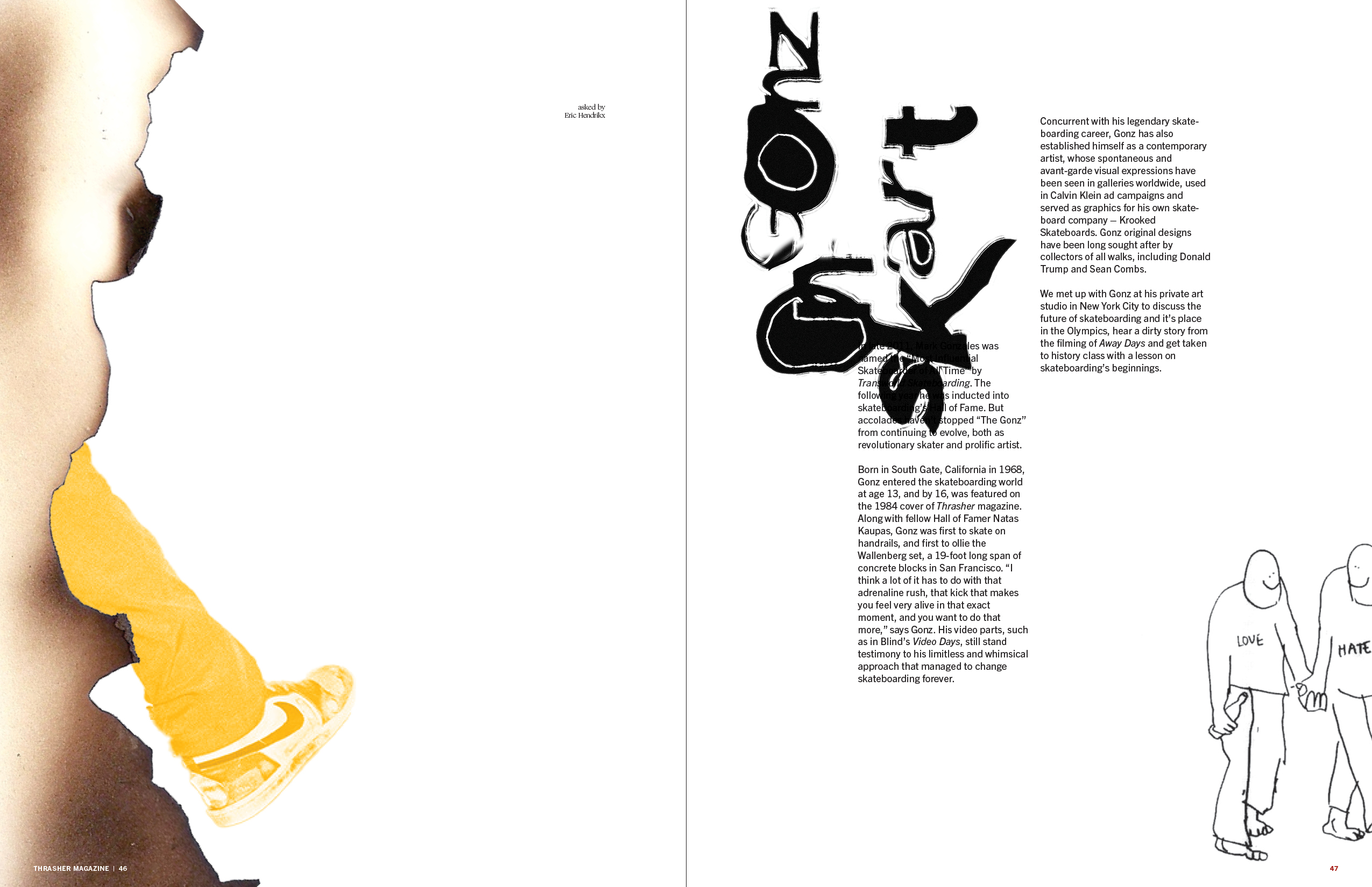
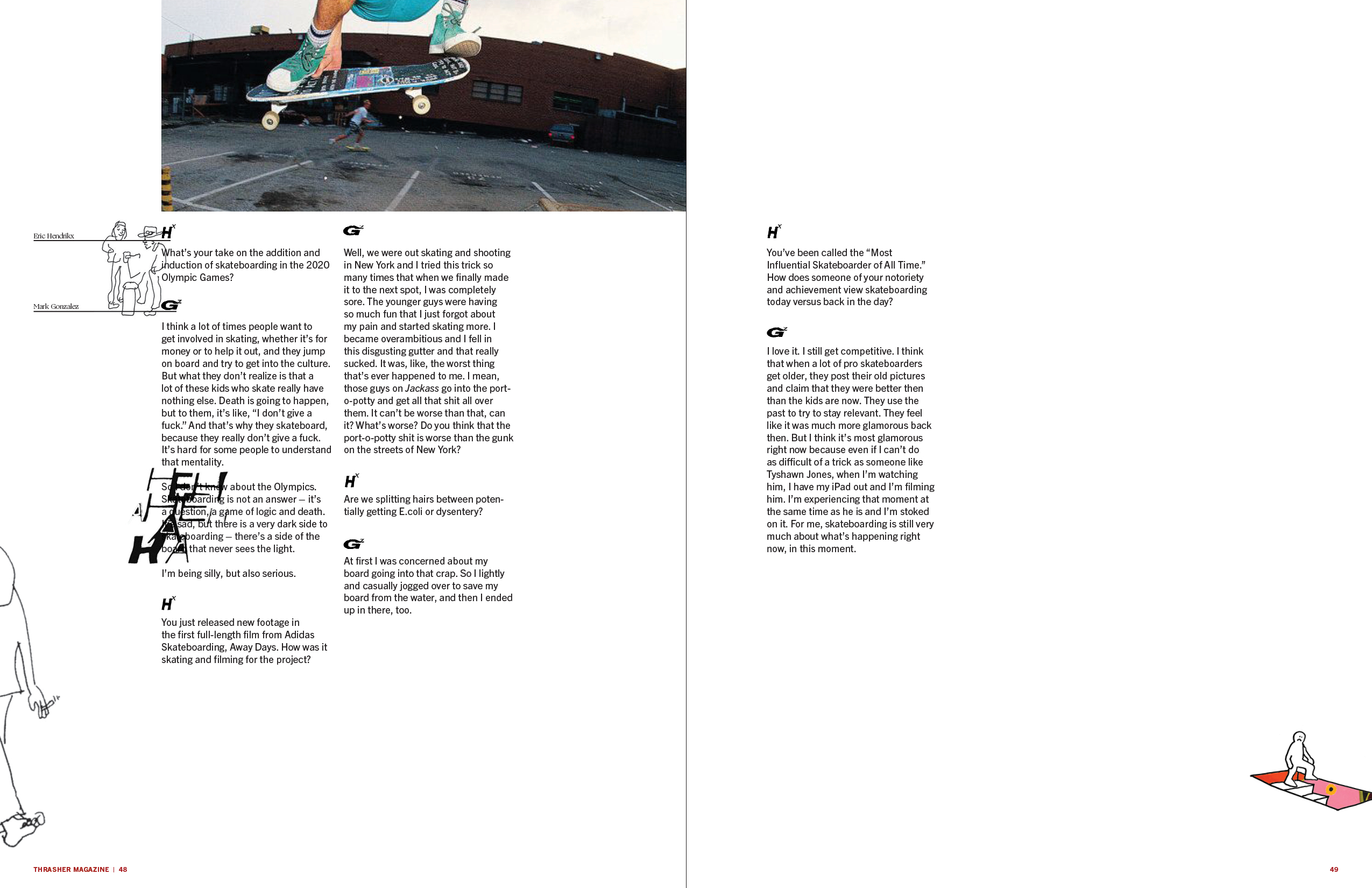
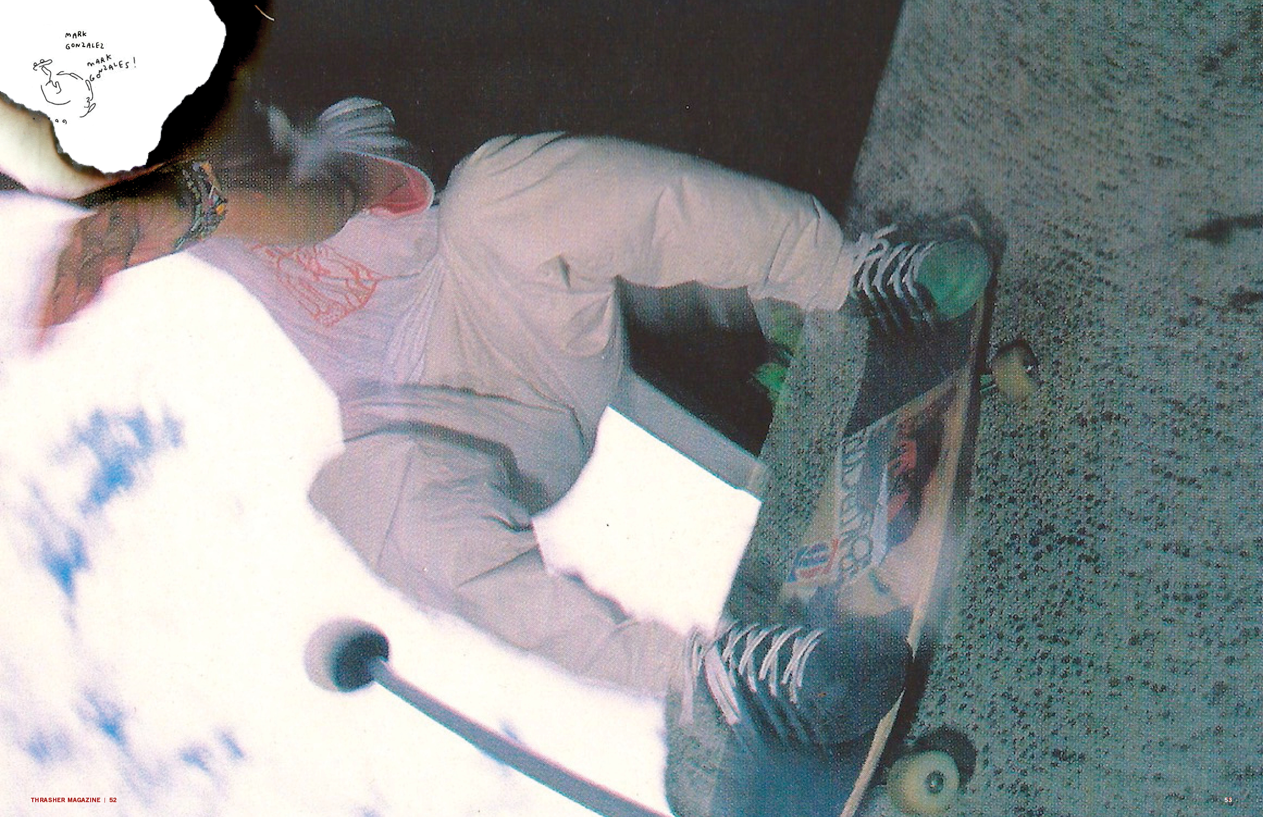
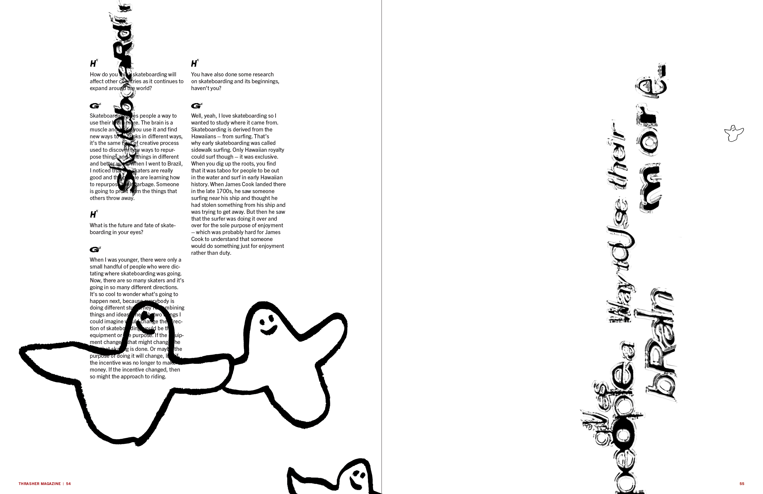
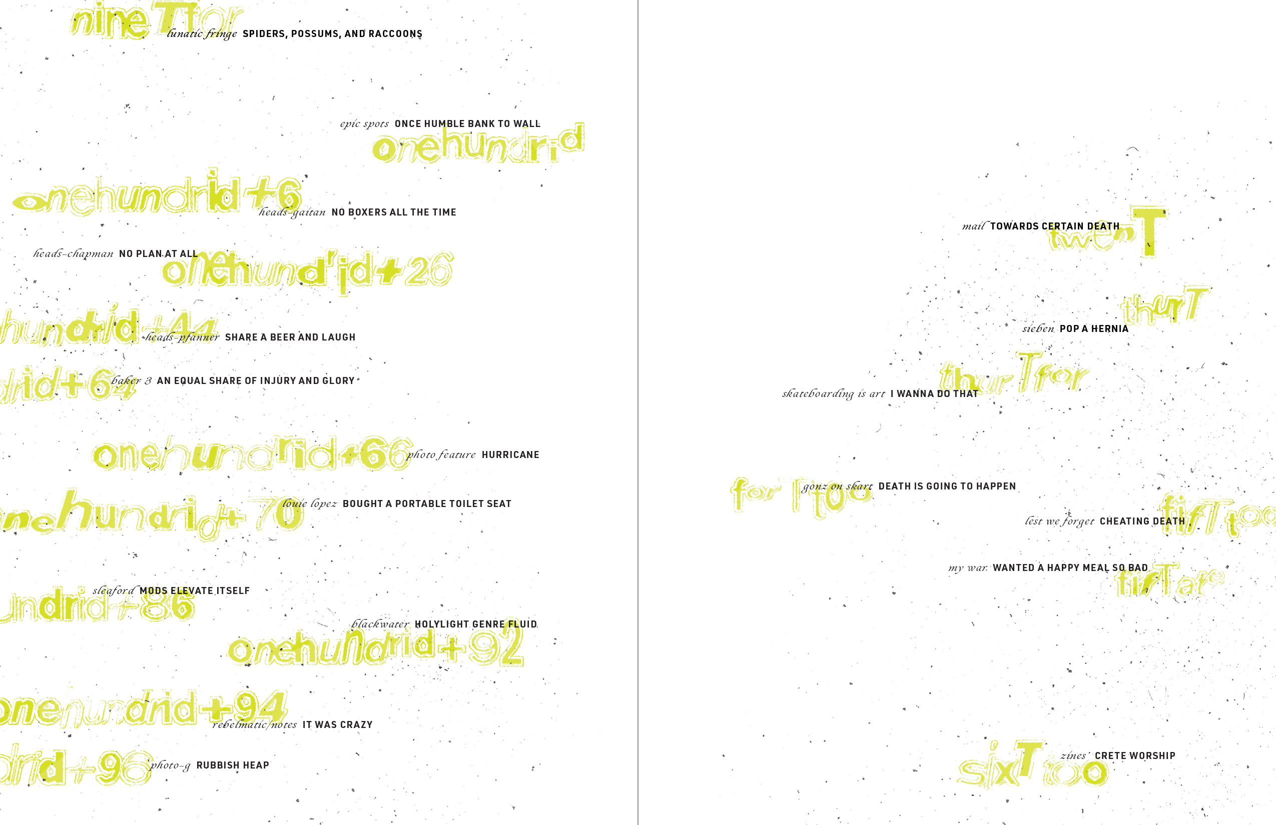
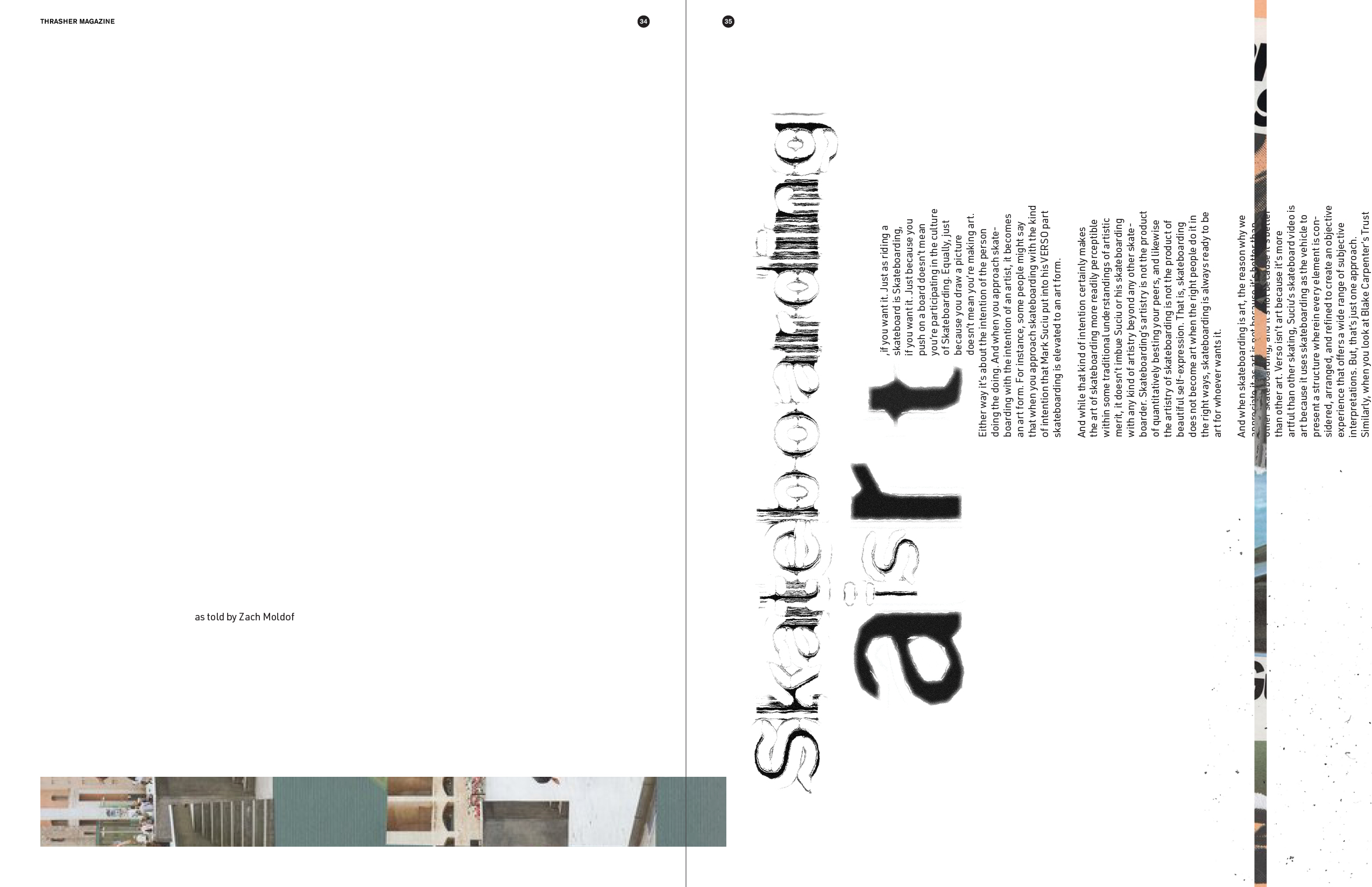
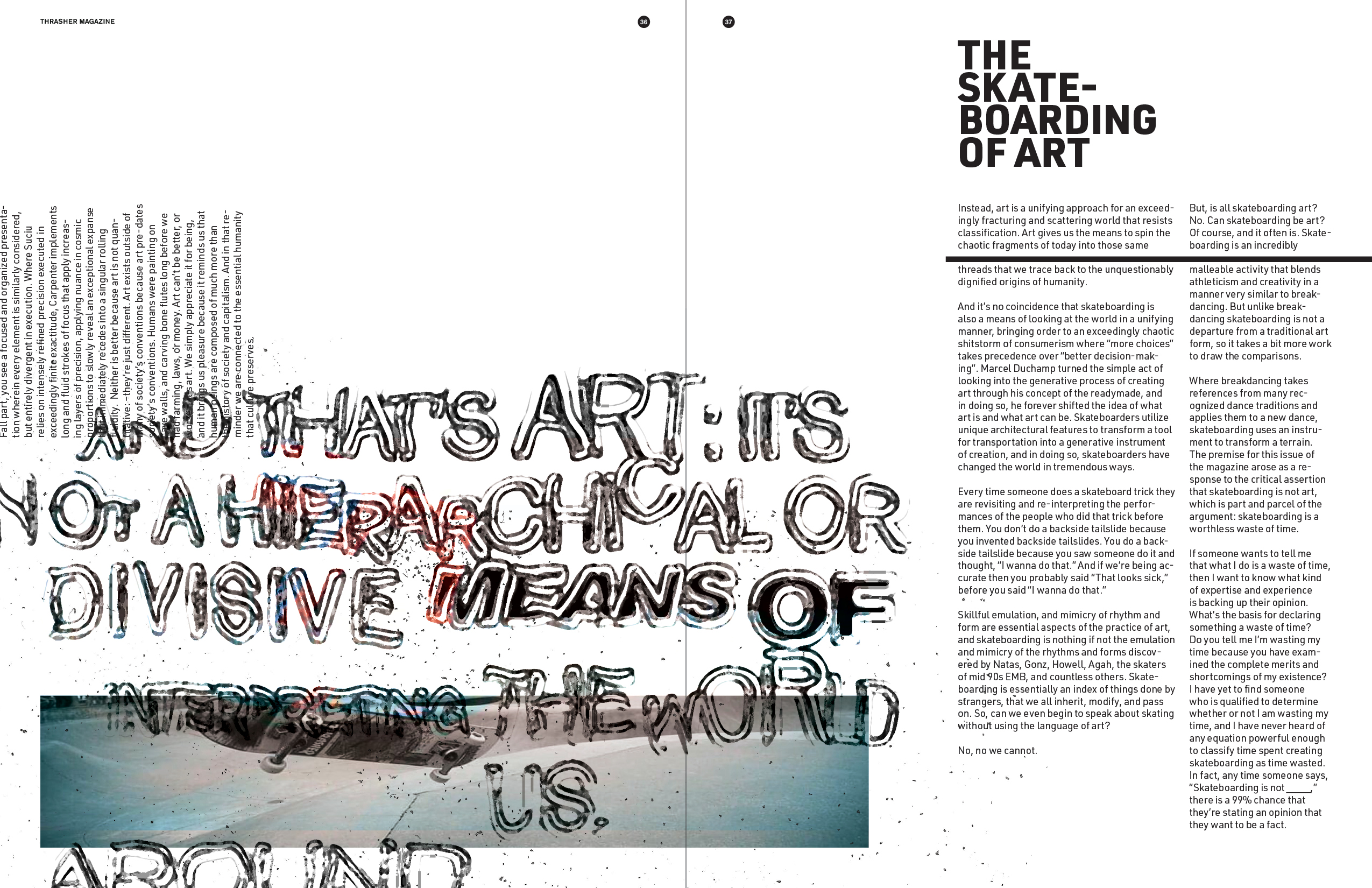
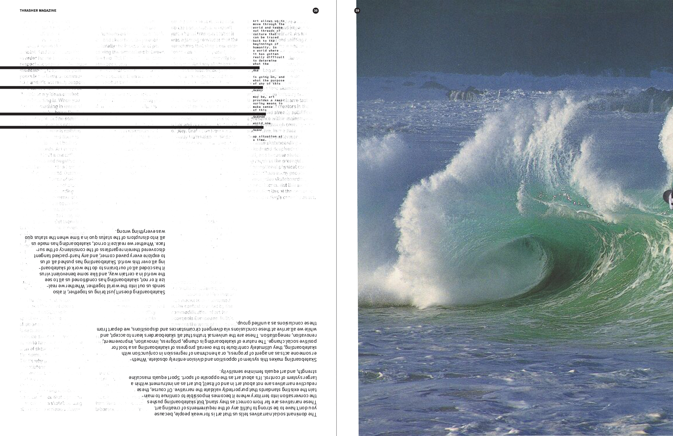
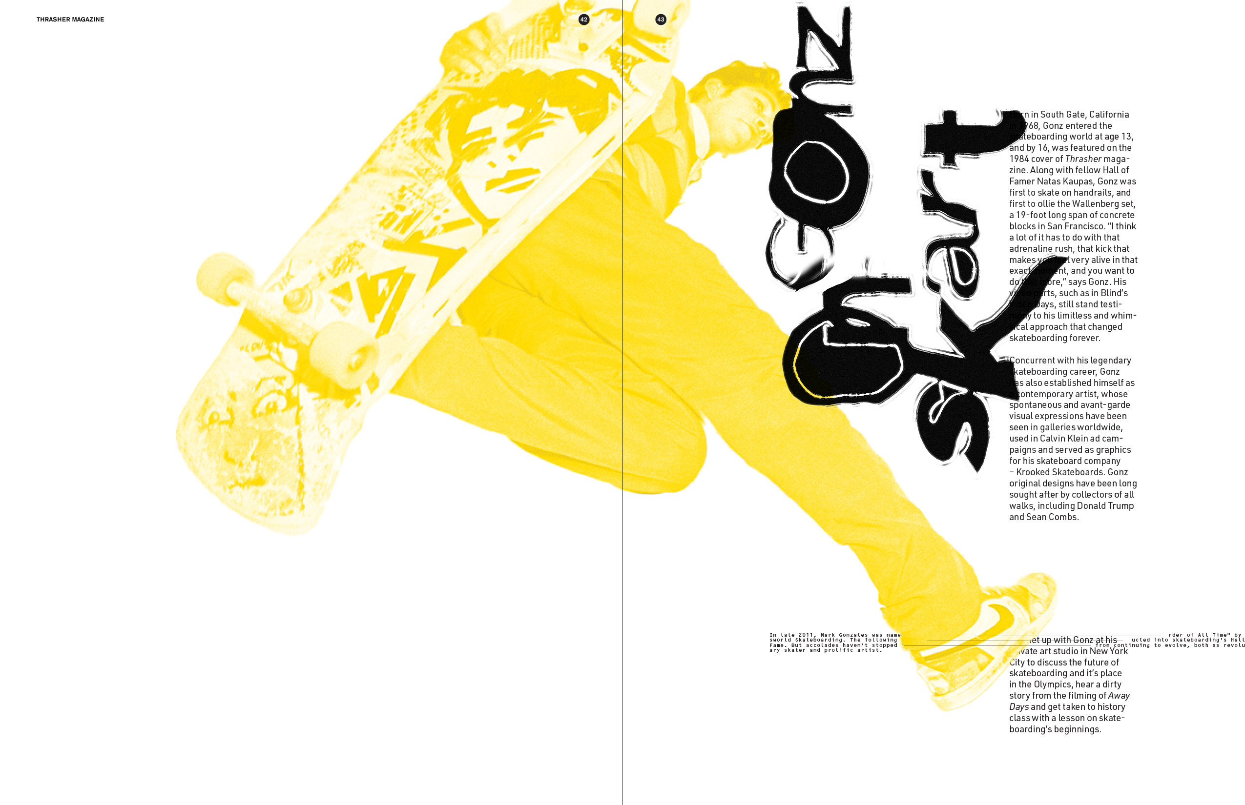
︎︎︎ Issue 1 utilizes digital manipulation techniques as a contemporary interpretation of “grunge,” turning content into texture and instilling a sense of kinetic energy. Overlapping elements and typographic distortion describe the daring attitude indicative of Thrasher’s identity. Through these expressive gestures, the magazine prioritizes emotional intrigue over literal readability. This is a recurring concept in both Issues 1 & 2, paying homage to the subversive design language which accompanied skateboard culture in the 90s.


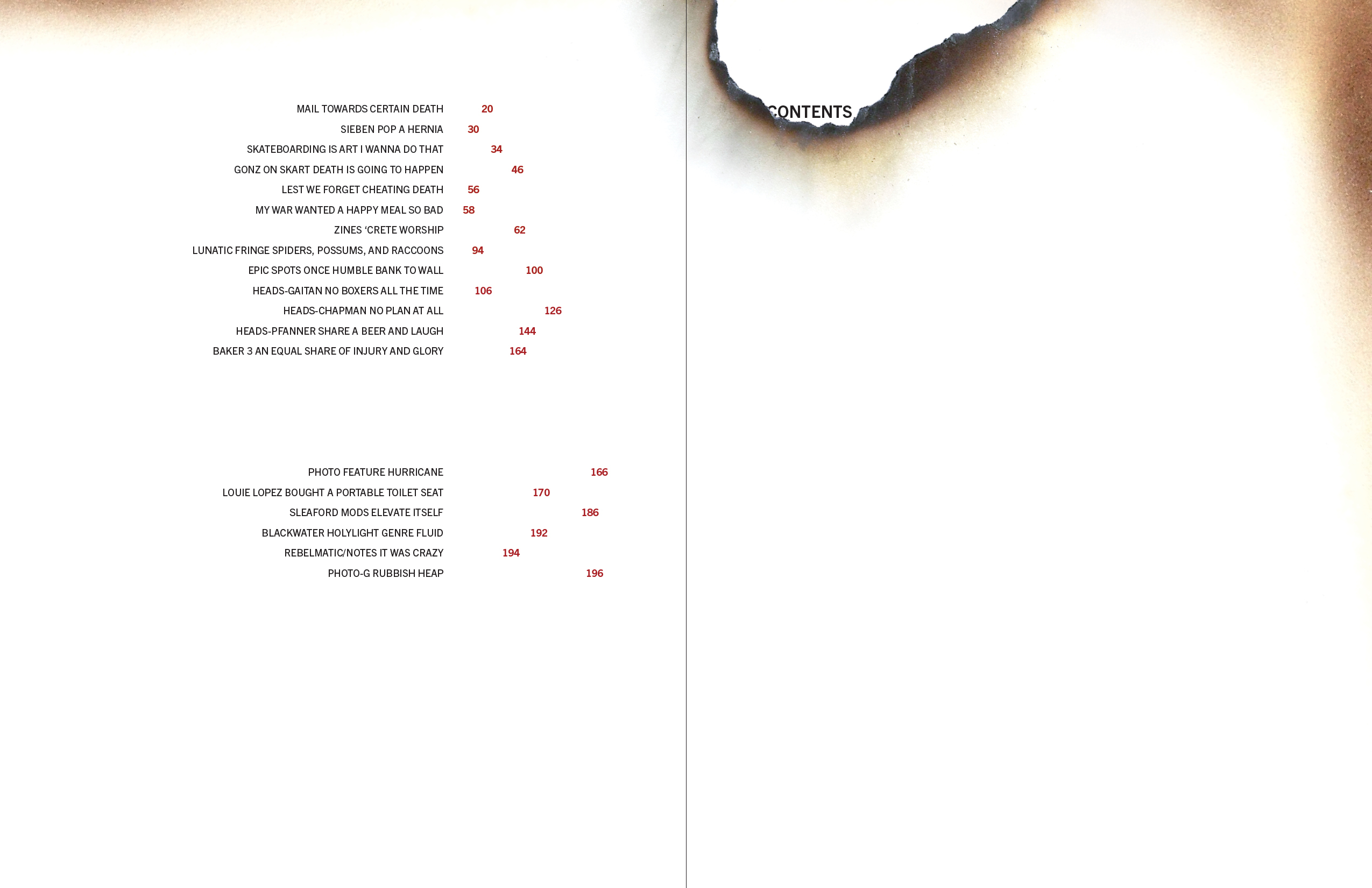
︎ ISSUE 2 — FULL FEATURE ︎
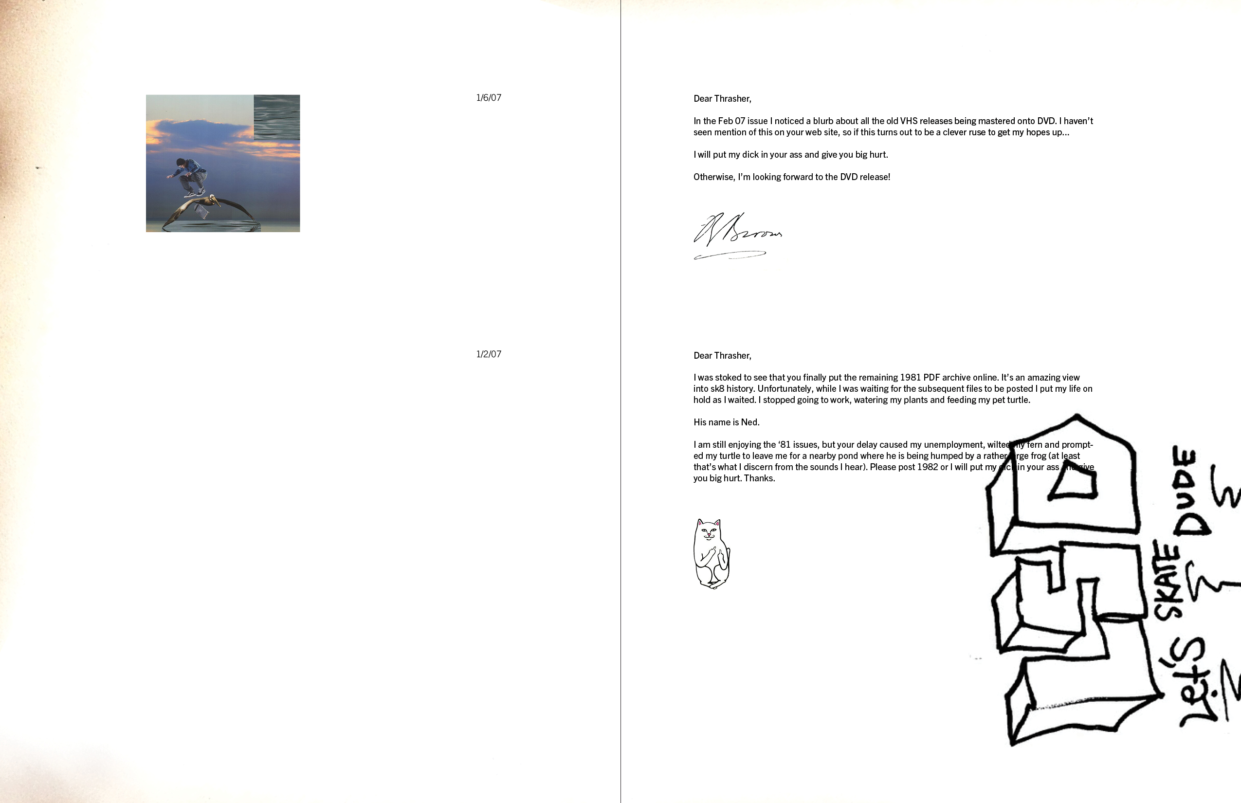
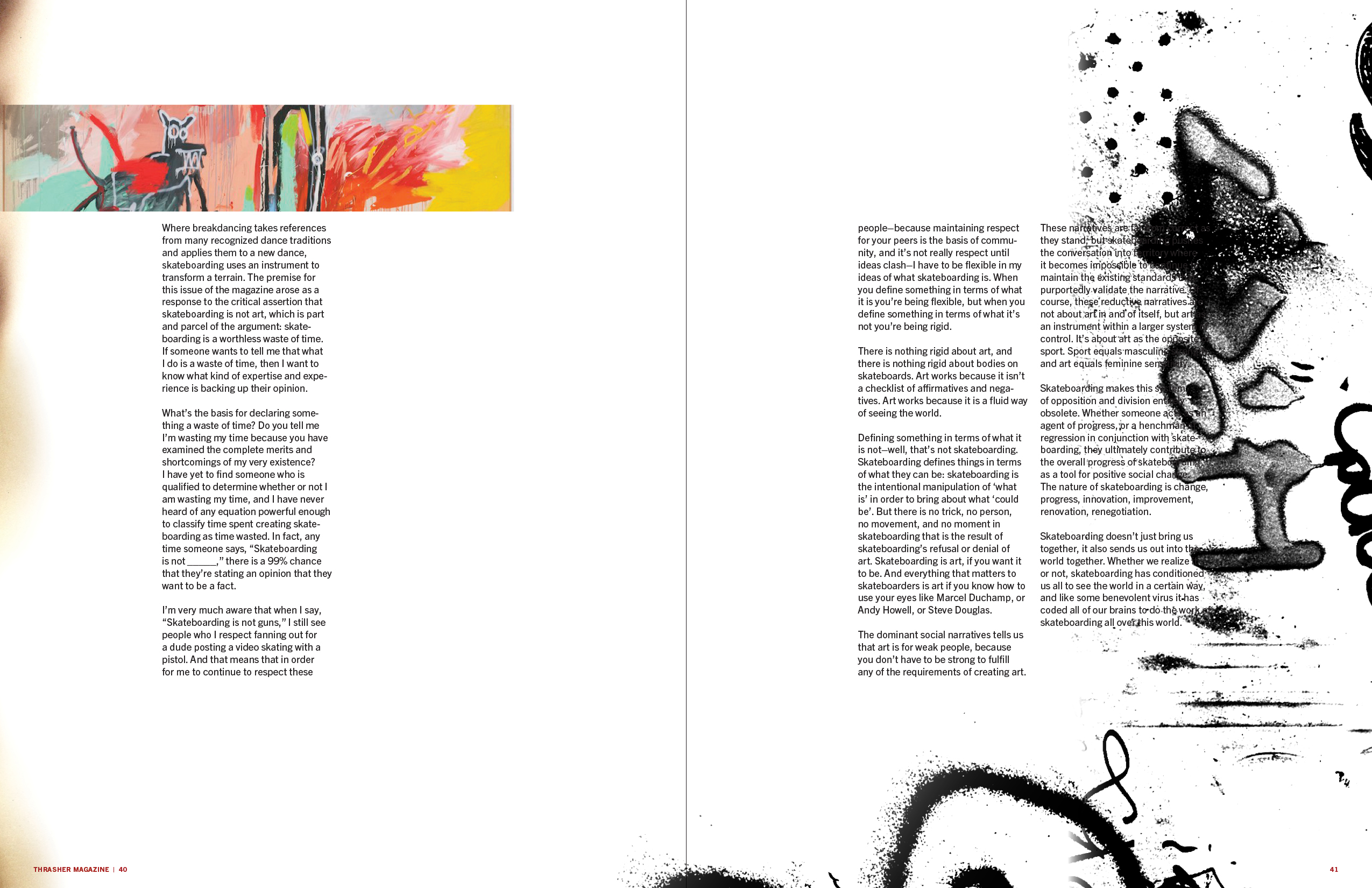
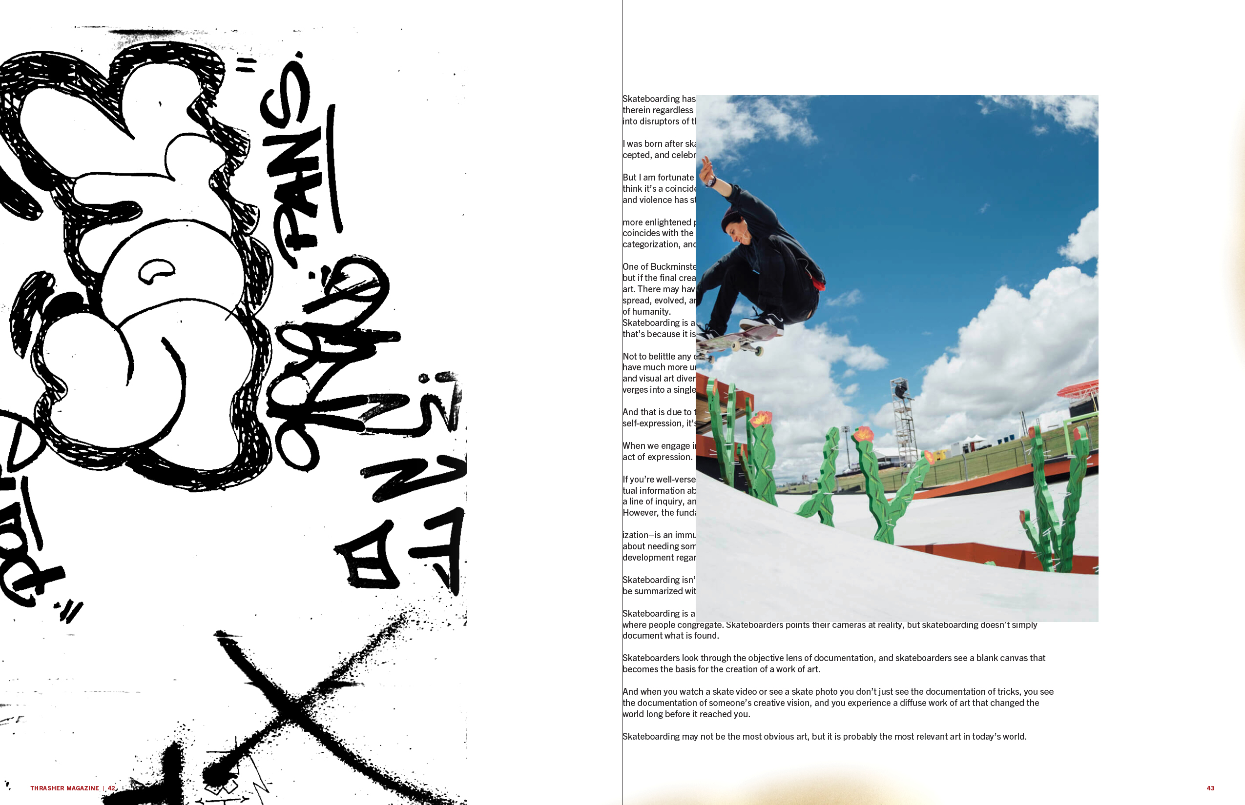
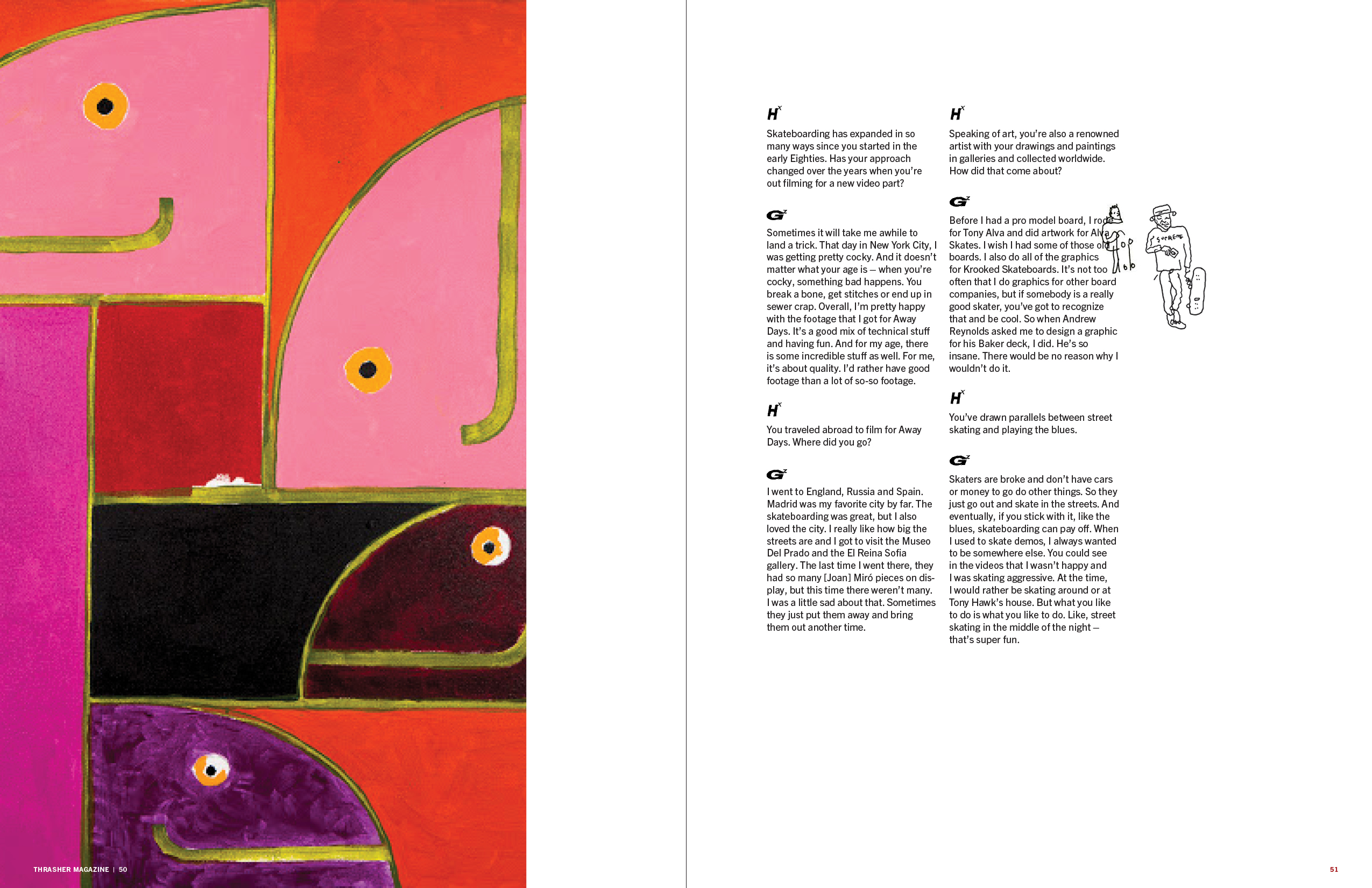
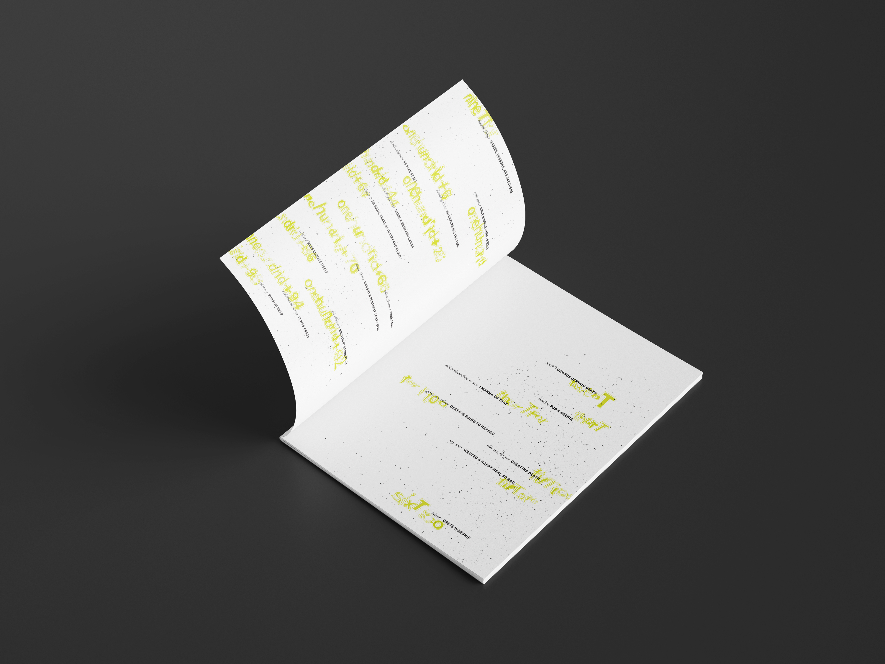
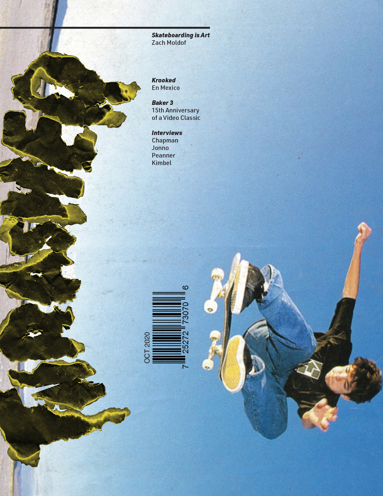
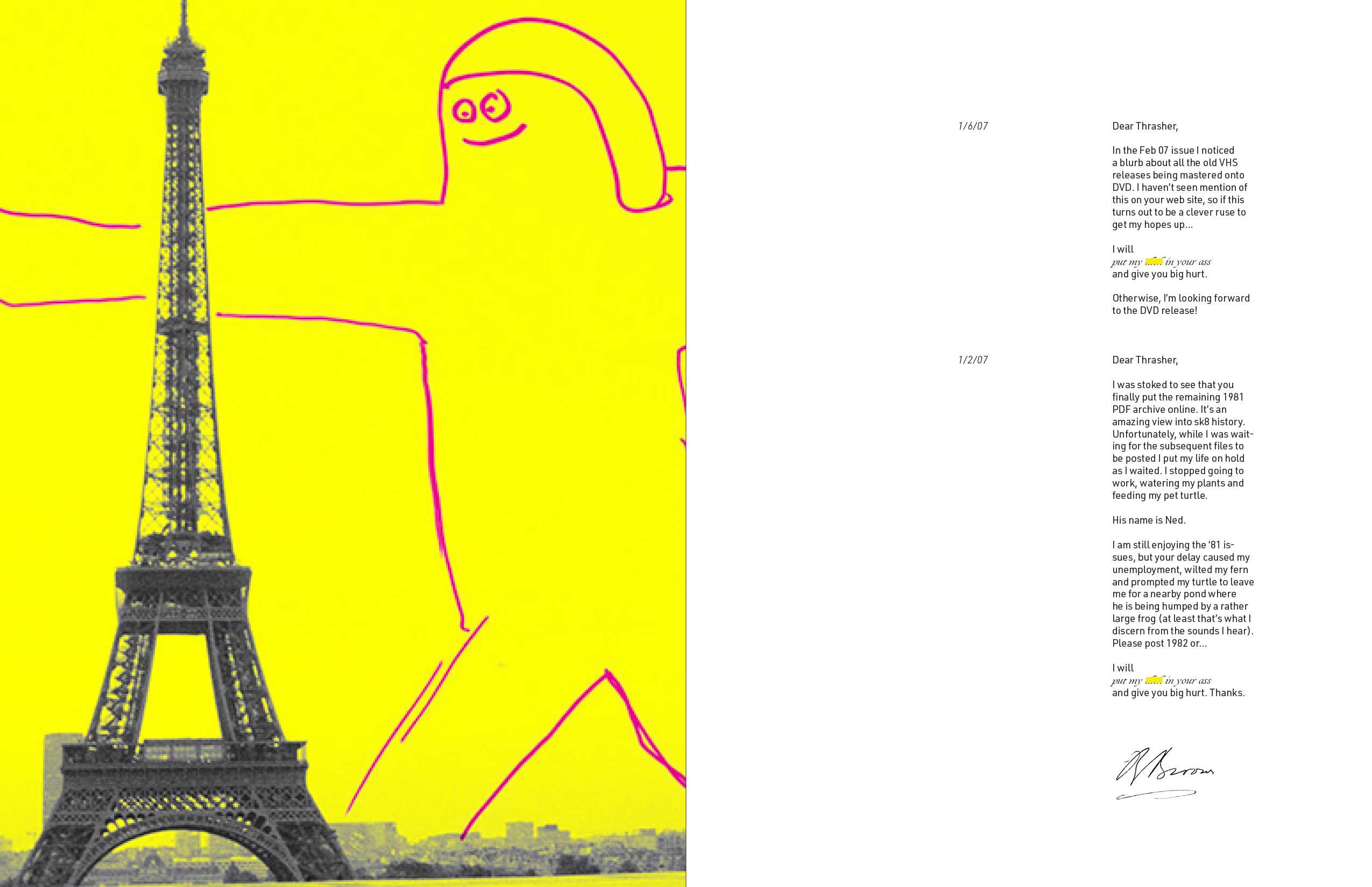
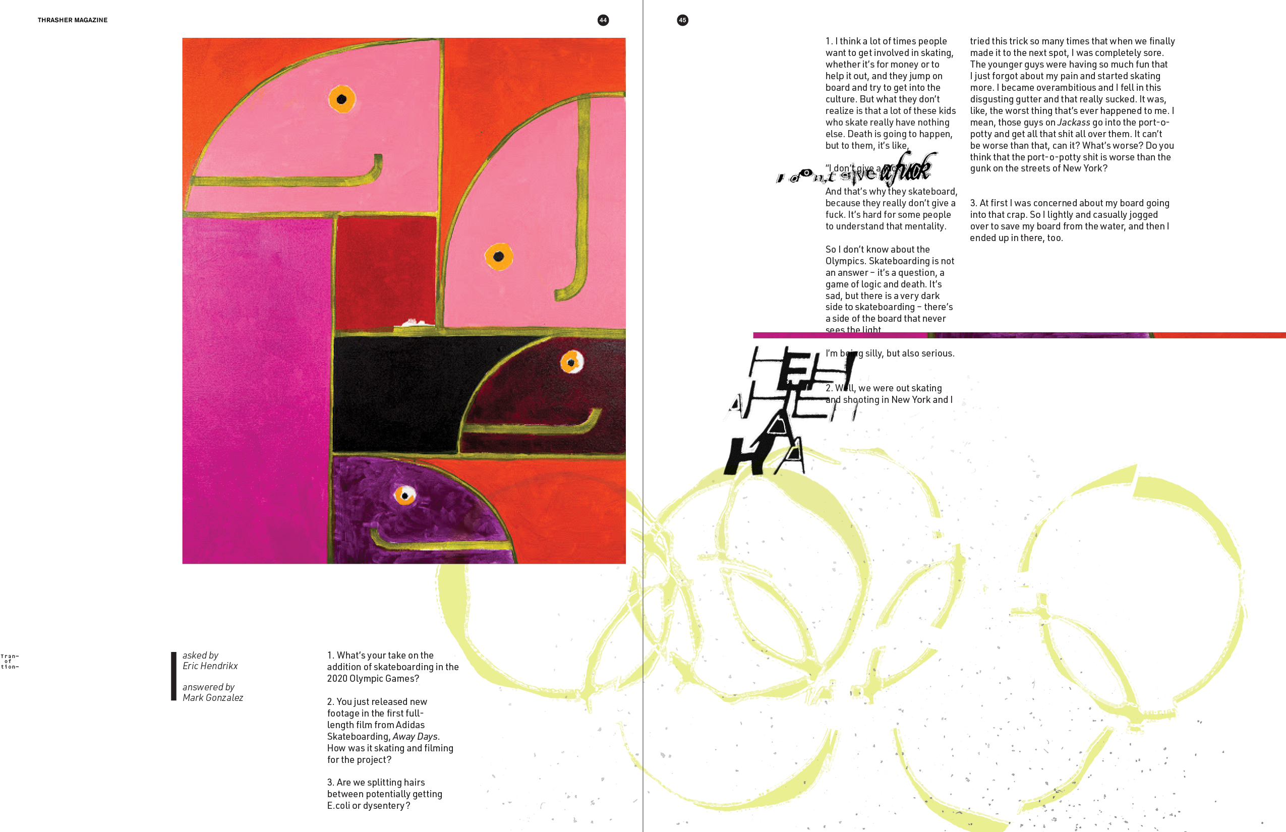
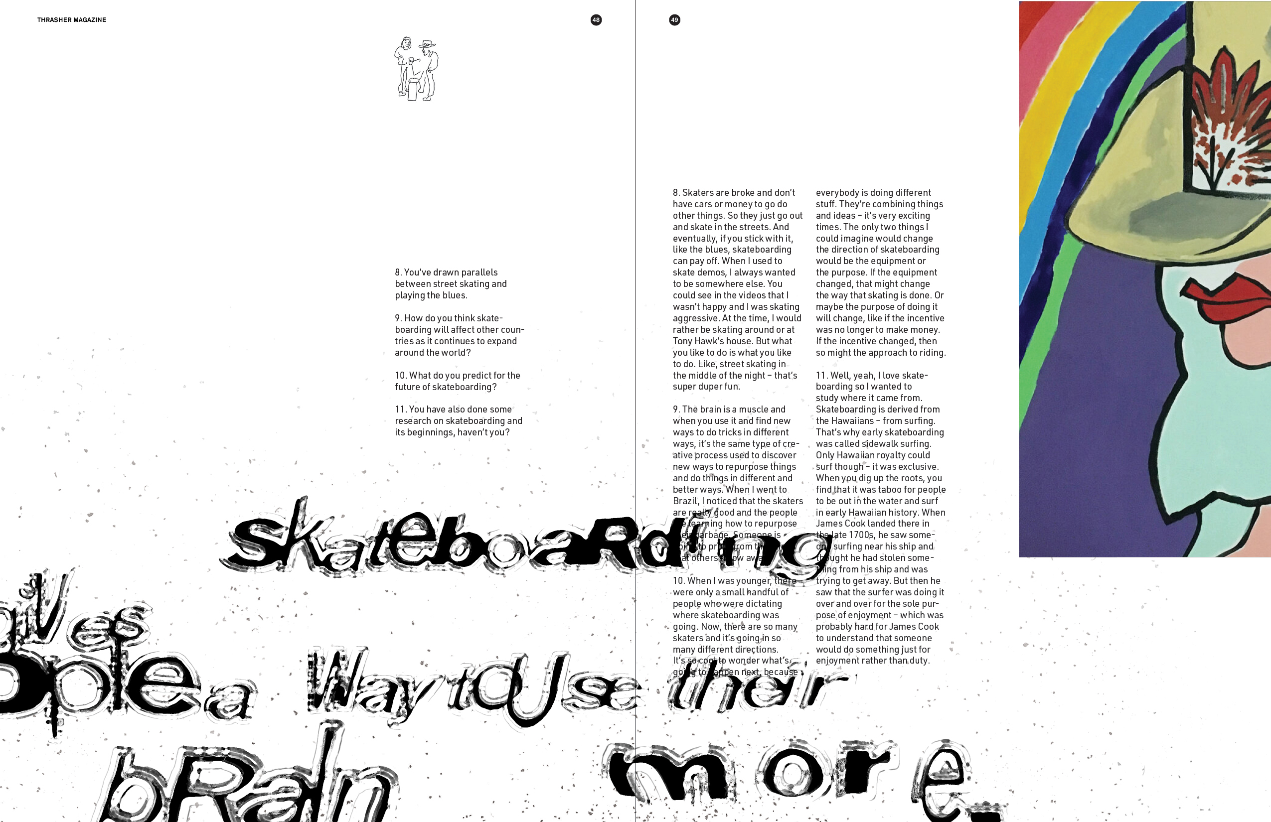
︎︎︎ Issue 2 features analog treatments which introduce physical dimension and add layers to the narrative. The use of vandalism subverts the editorial relationship between a published work and its audience. The magazine implies that the reader’s sensibilities, indicated by graffiti and burning, complete (not destroy) the finished piece.